What? I’m not the only one who said about it ![]()
Meanwhile, implemented everything myself ![]()
Would you like this appearance? Posts are highlighted and have ‘Author’ label near nickname. Works for both light and dark themes. Will add this update to my CSS topic soon. Green color is reserved for ‘Solution’ posts highlighting, so using somewhat blue-like for author’s posts.
It would have been better if MikroTik had us prepare the forum for them…
although I doubt we would have chosen Discourse…
Looks nice. ![]()
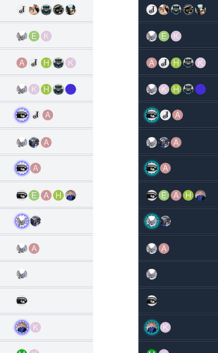
Cannot say if it can be done, but the (stupid) blue halo intended to signify (in thread lists views) that the original poster (or topic author) was also the last poster on a given thread is in practice invisible when the user icon/avatar background is in some colour (not only blueish shades), there should be a way (making the icon/avatar 20%-30% bigger?) to make this visible at a glance.
Honestly, I'm glad that it's even possible to tweak the forum appearance and minimize consequences of this awful design. If only I could do the same with WinBox 4...
Yep, I can do this, but just making it bigger won't help a lot in terms of visibility. As you mentioned, if they have similar shades, they wilI be barely distinguishable. I would suggest to make this halo with dashed or dotted style, so it should be visible even if it has the same color, as an avatar.
Like that

or

I don’t know, I think that seeing avatars shapes as
Ooooo
is visible, and more distinctive than a thin halo (continuous, dashed or dotted).
OT, but not much, I just discovered that a lot of people cannot really distinguish some shades of light blue from some shades of light green, maybe a (thicker) red halo #F05039 or a strong blue like #1F449C would be more visible…
Not sure about red, it seems little bit intrusive for such purposes. Anyway, it’s easy to play with colors. Currently made like this:
Good, it is well distinguishable this way.
The issue is only with Amm0’s avatar, that in itself reminds me every time of the toon bullets in Who framed Roger Rabbit, which I overlap with the James Bond’s movies intro, with the view from the inside of the rifled gun barrel to obtain the image of an insecure bullet that decided to enter the barrel sideways.
Updated the topic: Improved visual appearance (CSS based) - #13 by teslasystems
Both changes with posts highlighting and avatars highlighting are included.
If you want to play with avatar halo colors, there are 2 variables at the very beginning (in the :root section)
--d-avatar-halo-border-color
--d-avatar-halo-glow-color
@normis, can you please look into it again? No need for custom background. Here is an example of Spiceworks forum. Simple and unobtrusive.
Yes that be helpful. Although, there is plenty of room next to poster name for a tag, instead of wasting more space below.
On…
Mario Kart. And checkered background was an artifact of the old forum not dealing with transparent GIFs. And, no, I did not copy @mrz’s Mario theme.


