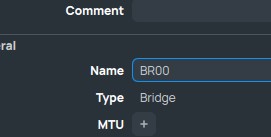
I miss a LOT, that the name of a value I changed does not change color!
For example, if I rename a bridge, the value “Name” got blue the moment I changed something.
This is such an important feature:

I miss a LOT, that the name of a value I changed does not change color!
For example, if I rename a bridge, the value “Name” got blue the moment I changed something.
This is such an important feature:
With the row padding option set to 0 I get the required density of table rows and I start to like the new Winbox and actually using it.
Please reconsider the font used for table values: The decimal dots are tiny and almost invisible between the digits. This makes reading of IP addresses and speeds unnecessary hard. A fixed with font for table values would be much easier to read.
New windows or prompt boxes open on the upper left corner of the screen unlike Winbox 3 where they opened in the middle.
Example: On interface window click on new and select PPP Client then the new window open on the upper left corner of the screen and it’s the same behavior for everything else.
Bug:
Winbox 4.0Beta16
Windows 11 24H2
When I have a workspace for a physical router that I have windows open that are specific to that router (like health window) and are not available on CHR router then if I try to open a CHR router with same workspace I get the following error:

Besides the fact that I don’t like Torch at all in Winbox 4, the connection tracking in the firewall is a disaster that almost never works.

I posted this same thing several months ago (http://forum.mikrotik.com/t/winbox-4-is-here/178358/1393) and got no responses.
Agree it’s annoying you cannot filter by ports. But it’s also a problem in CLI/APIs too, since you cannot filter by port there either. So not exactly winbox4 specific – although winbox4 certainly could do some client-side parsing of ports.
It be better if /ip/firewall/connection’s ports were stored as separate attributes, instead just one – that likely automatically carryover to winbox/webfix since all UIs use same CLI/API attributes to display.
Any idea why this might be?

It’s in the “known issues” in post #1.
********** STATUS UPDATE Dec 13 ***************
Known issues to be addressed :
[…] Can’t ping DNS name
But in general winbox4 really should resolve DNS (or have some content menu/shortcut) on the client side… I mentioned this in #1197:
BTW, this list of issues in post #1 if very outdated. Some problems are fixed already, and many should be added…
They are getting somewhere with the last betas, but I’m still struggling getting used to these new “comments”.
After YEARS of tweaking comments in many ways to help readability (I’m talking about very complex setups with MANY rules), now it’s almost impossible to adapt/port the same stuff.
I would like, at least, the possibility to add DUMMY lines with text (best with colors as well ..like pfSense does)
I add dummy lines to the firewall this way:
/ip firewall filter
add action=log chain=-------- comment=-------------
(I use these as separators between different chains)
I do almost the same, ‘dummy’ chain for all (long) comment but the problem is that if I disable inline-comment for firewall .. it’s a readability mess in all other windows which are tuned for inline-comment (on). I have to switch back and forth → or back to winbox3 were this setting is not global.
In any case, our custom tweaks are obviously not included in MT thoughs when they design it; it would be better to have something that is dedicated and designed for it.
I think that the pfSense example can be a good starting point.
Winbox for Mac application crashed: "Termination Reason: Namespace SIGNAL, Code 11 Segmentation fault: 11
Winbox for Mac 4.0 beta 16. MacBook Pro with M2 CPU, macOS 15.2
Mikrotik Support have logged this report as SUP-177496.
I just upgraded to Winbox 4 and (beta 16), routeros 7.17 and I have a multiline system note that uses whitespace to format some large ACII text.
In Winbox 3, this displayed correctly using the same font as the terminal does when the system note is displayed on the GUI.
In Winbox 4, the whitespace is not displayed consistently, and space characters are compressed at login on the GUI. The terminal still shows it correctly.
Looks like the wrong font was used to display the system notes at Winbox login. Is there any way to get it to use a proper terminal font like it did in earlier versions?
Been using Winbox 4 for months now, very pleased with the improvements.
One question: with the new design, any chance of getting PKI based certificate logins in Winbox to match SSH?
It’s so funny to hear about “improvements”.
Where are these improvements? From the very beginning almost all changes are related to fixing the bugs and fixing consequences of silly “modern design” decisions. And even despite of this, there are still lots of problems and it’s still worse and inconvenient compared to WinBox 3.
Though, to be fair, I like 2 things: ability to hide tabs that you don’t need, and ability to collapse/expand directories in the File List.
Is not a Linux version a big improvements?
May be it’s good for some people, but considering that there is a wine, it’s not a big improvement. It doesn’t affect the app functionality. And the app was called WinBox, its name says for itself.
OT:
Phonetically this makes a quite good pun …