I'm less[/not] concern about Manrope as font for all text... but just point out https://mikrotik.com/logo specifies for Typography...
By using our defined design typeface we are consistent across the board. No matter is it device labels or marketing brochure, it’s always the same unique look that makes us stand out and be recognisable.
...now I'm not a stickler for rules myself, but on the JetBrains Mono... that was an inspired choice.
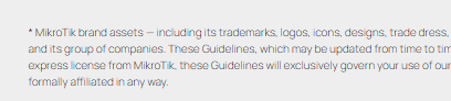
Oh no no no no please no Manrope! That font has plagued WinBox 4 enough. It’s a low quality font with no proper hinting, while being too thin. Unless you have super-high-def screens or blow up the text to huge sizes, the rendering quality is bad. Here is how it looks on 96 dpi screen on that linked MikroTik page:
Fonts for text on forum should prioritize legibility on all screen. The current font (Inter Variable) does the job well enough, it certainly miles better than Manrope.
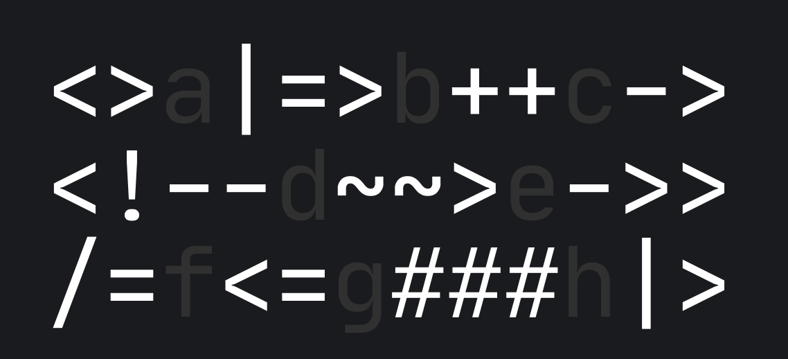
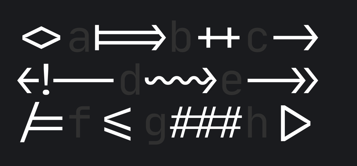
I also disagree with the use of ligatures for code blocks on a public forum, that newbies will also read. You are familiar with RouterOS syntax so the fancy ligatures might suit you (I personally hate them), but for someone still learning, it would be much less confusing to have the individual characters displayed as-it, instead of having to try to decipher / deconstruct them.
The current CSS has this specified as font-family for the code sections: ui-monospace, "Cascadia Mono", "Segoe UI Mono", "Liberation Mono", menlo, monaco, consolas, monospace.
Here is probably your issue: ui-monospace is only supported by Safari. But it’s first on the list, which means if you use Safari on your Mac or iOS devices, you’ll get whatever default monospace font used by Apple, is that Courier?
On Windows however, ui-monospace is ignored by the browsers, so we get Cascadia Mono on modern version of Windows, which is a great font (Cascadia Code is its variant with ligatures that is used in VS Code). Older Windows installations will get Consolas, which is also a very nice monospace font.
Linux distros probably have Liberation Mono installed and that what will often be used. For Android, I think the final monospace means Droid Sans Mono would be used, and that also looks very good and familiar on my Android devices.
Maybe the fix would be to get rid of ui-monospace from the list. I believe monaco is an Apple font that would then be used on your Mac.
JetBrains Mono could be added to the list, but I would like it to be listed after Cascadia Mono, and not forced down as embedded woff2 font. The current InterVariable.woff2 embedded font file has a whooping 310KB download size already.
... so it at least be an option for theme/custom CSS... even if not "default".
And perhaps the CSS for code blocks in posts of type ```routeros could use it. Highlight.js that's used for rendering the code block does have CSS descriptors so it could be limited to just those blocks.
Now Highlight.js V6 only coloring is actually more annoying than font selection...
@rextended - Thanks, I missed those colorful discussions since I now lack of “Active Posts”/“My Post” equivalents… But I never knew Markdown’s backtick are to all Italians.
Not Italians, MOST non-US/non-UK keyboard miss them.
JFYI, on German keyboard the key exists, but usually behaves differently.
For what It Is worth:
ligatures are confusing to MOST people, including myself.
jetbrains Is a terribly looking font, while It may actually be good (and distinctive) for short text (like the iptables flowchart boxes) It Is way less readable than (say) the mentioned Consolas.
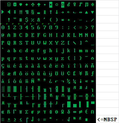
And this comes from someone that has also an old PC using green font on black background using in console White rabbit.
In my opinion, if it concerns scripts, it should simply mirror exactly how the terminal appears in WinBox,
without any other frills.
Ligatures & Co. are not in the terminal.
I don’t understand… who is the 1d10t who forgot to insert ` and ~ (which are among the basic ASCII-7 characters, not the extended ones) in the Italian keyboard (and elsewhere).
Inserting them into the keyboard, as I did, does not in any way affect anyone’s habit (which lately is always poorly respected by some damned rude people), since it adds the missing characters with “ALTGR+”
On my case ALTGR+’ = (backtick grave accent) and ALTGR+ì = ~ (ì has in top ^, so is mnemonic if not printed on physical keyboard.
Keyboard layouts come - more than anything else - from tradition.
The “backtick” is actually a grave accent.
In Italian the amount of àèéìòù used is so relevant that what is (on other keyboard layouts) obtainable with ` and ´ as dead keys followed by the letter to be accented like it is done on other keyboard layouts would have (seriously) slowed down typing.
The real mistery is why we do have ç and § readily available.
And the real issue is with laptop keyboards without numeric pads (on Windows).
On your “everyday” computer it is of course not a problem as it is easy to remap a couple keys, if you use it for writing code (also Powershell needs extensively the ` characters and even batch in a few usebackq cases), but when you are using someone else’s computer it is considered bad etiquette to remap their keyboards.
On Linux the ALTGr+’ and ALTGr+ì are - I believe - already “standard”.
But add is not like remap…
When € is added on ALTGR+E and ALTGR+5 (at least on IT keyboard) nothing change.
it was time to add ` and ~ too
If you happen to take a look at how I arranged the Windows keyboard filter, you will see that I also foresee the absence of the < (shift >) key which not all laptops have…
Hehe, but what does the "A" in "ASCII" stand for ;), certainly not Italian, or German, or French...
And you can't assume that ASCII-7 was standard everywhere. In the day before Unicode and multi-byte code points, when for many languages everything must be squeezed into 8 bits, many languages (mine included) did have to shove their language specific characters in the 128 slots of the ASCII table.
Many countries also have their computer keyboard layout evolved from ancient typewriter layout, which came from the time where ASCII was not a thing at all.
But I was referring to those who chose the Italian keyboard, not to the fact that ASCII-7 did not have Italian/foreign symbols. ` and ~ have always been present and never changed…
Just looked at this JetBrains. No, no, no, don’t like it. Seems, terrible WinBox 4 uses this font either (or similar)…
Well, if someone like it, could be added to site settings, why not. But don’t replace it.
 to all Italians.