Hi there!
First, thank you for the native Winbox version for macOS and Linux. We appreciate a lot!!
Due wine incompatibilities and my daily use of macOS, I tent to use the winbox beta version since months.
Today I would like to share with you some feedback in order to improve the app since in the previous YouTube video
(MikroTik reacts to your comments: autumn edition - youtu.be/spQQUtVbQfA 5:05) you confirm the change of menu wrappers for the previous and great tabs system.
Thanks for that change because the wrappers is so slow due to info collapse and scroll movement.
So, I have encouraged myself to share the little details that I miss:
***** Home Screen ****
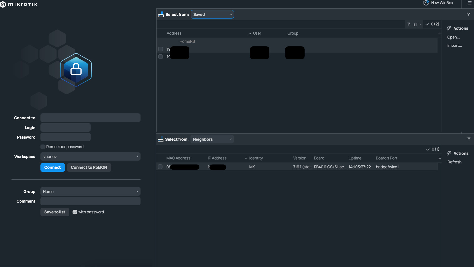
The actual start screen waste a lot of UI space and it would be great if have neighbors (and RoMON neighbors) in one and the saved in the other. Both in front of the user like the image below.
***** The comment button ****
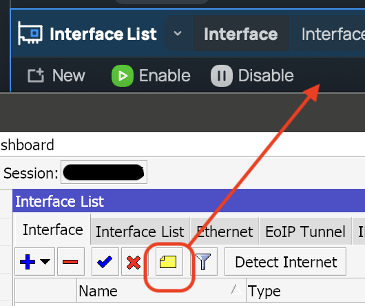
I miss a lot the comment button from the previous Winbox 3.x because I usually comment a lot. I think is an easy add-on for the final version.
***** The quick torch feature ****
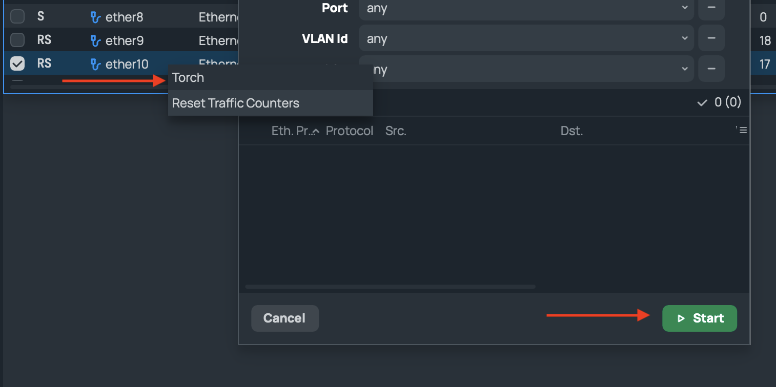
When I press right-click over an interface, the quick access to the torch tool appear, but in Winbox 4 we need to press the “start” button when in previous version it opened and started by itself.