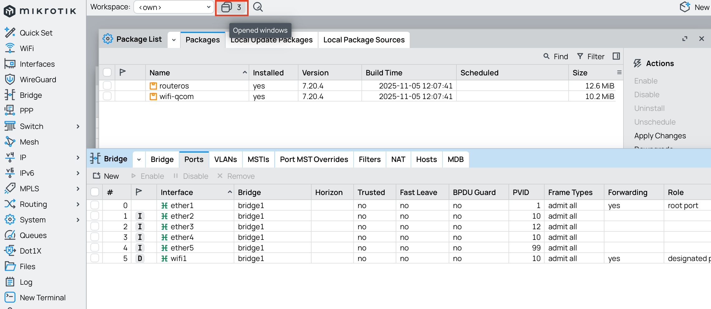
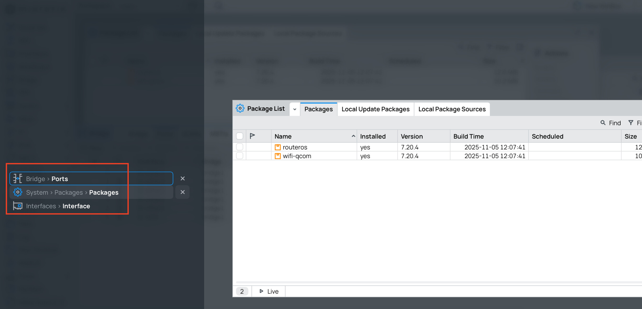
Current solution of “window switcher” is wrong - activation button is in top bar of the window but after clicking it user is forced to navigate far away to left side of the window. I have few ideas how to solve this:
- Combine current overlay view with dropdown menu from previous solution (selection in dropdown as it was pre-beta 42 or 41, but on top of current overlay switcher view - ditching that window list on left side of switcher view overlay)
- Move window switcher button to left side so it would be near of window list of switcher overlay view.
- Revert to previous solution (dropdown without switcher overlay view).
I would prefer option 1 or 3.
Here’s the illustration of the problem with current implementation.