The UI update is a welcomed update. Yet, I am not convinced by the current iteration. We went from the “ugly” but very functional style and clear to read to the “pretty” but less functional & "harder to find what you need "style. Functionality and ease of use does take priority to it being pretty for me.
Try to add a new firewall rule or look at the interface list for example. What am I even looking at? Just a blob of text with almost no coherence. No indentation no grouping. The gray on gray doesn’t have much contrast. The tabs are gone and now you need to scroll twice as much for everything. The graphs are horrific to look at. The more I look at the UI in Winbox 4 the worse it get. Yet I still hope this will improve since it’s a beta.
I know that couple of versions including this one exists, but they rely on reversed engineered MT mac-telnet protocol that can change overtime.
For example this particular one hasn’t been maintained for almost a decade and was unable to connect to ROS 6 for quite some time, and although development was resumed this year I am not too eager to just blindly download and compile some utility from GitHub especially after xz backdoor saga…
It was not unmaintained, the information on how to authenticate with RouterOS 6.43 and later was missing. Just took some time to reverse engineer…
Blame Mikrotik for that. I can understand why one does not want to open source all it products. But why keep protocol details secret? (Hint: Security by obscurity never worked. Invent proper protocols, and release the details!)
Any hope of getting an android build of this, too? The current Mikrotik app on android is missing a lot of features and I often find myself needing to do winbox stuff on the go
So far, not impressed at all.
Too much empty space, many things missing: TABS - I hate this solution with menus, grouping and sorting in initial screen, “open in new window”, table lines - alternating white and grey is so Excel 97 looking, not remembering screen position, of all windows only Terminal doesn’t open in full width - and it is only one that should, Search box should be open automatically all the time …
I know, it is alpha version, but you should have started with latest stable feature set and build up from there.
Not to be that everything is bad: I like new font in Linux (didn’t test other systems), I just LOVE being able to resize whole interface with Ctrl + mouse wheel, I like the new status line.
EDIT: I was able top make it run (but please support Wayland natively) with
QT_QPA_PLATFORM=xcb ./WinBox
because QT_QPA_PLATFORM was wayland.
----- original message
Doesn’t even start on a default Ubuntu 24.04 installation (which defaults to Wayland):
$ ./WinBox
Warning: Could not find the Qt platform plugin "wayland" in "" (:0, )
Fatal: This application failed to start because no Qt platform plugin could be initialized. Reinstalling the application may fix this problem.

Available platform plugins are: xcb.
 (:0, )
zsh: IOT instruction (core dumped)  ./WinBox
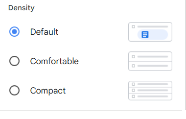
I love the fact that it is based on Qt. The old version was very information dense as far as like margins and padding and the like. I would like to see a setting where adjust that, similar to how gmail works with its default comfortable and compact.
I know white space looks prettier, but anything that keeps me from having to scroll to see more information is a plus for me.
New version should be automatically available upon launch.
What's new in v4.0beta3:

*) fix crash on macOS 11

What's new in v4.0beta2:

*) allow closing regular windows with Ctrl+W, Terminal still Ctrl+Shift+W.
*) restore possibility to filter by flags in table filter view
*) increase comment column wrap button size and width when wrapped
    - also hide resize mouse style when comment colulmn is wrapped
*) fix app stability when table filters used
*) store current workspace (if autosave) state when switching to other
    - also fix potential crash on Workspace apply/ok
*) remove unneccessary debug warning

What's new in v4.0beta1:

*) initial beta release
I am aware this is alpha/beta software and the following is meant as a suggestion.
Something I did like in the old(er) inbox is that one can see the the physical interfaces VLANs are connected to Right on the Interfaces tab.
In the current view of “Interfaces” I do see the VLANs as if they are any other old NIC. I can see how that can also make sense, but now if I want to know which VLAN is on which physical port I specifically have to open each VLAN.