Yep, it’s here!
If you notice errors, mistakes, typos: let us know!
Also make sure to clear cache, reload and the usual.
Yep, it’s here!
If you notice errors, mistakes, typos: let us know!
Also make sure to clear cache, reload and the usual.
Please add sorting options for the hardware ![]()
Interesting that the new website makes extensive use of JetBrains Mono. Is Manrope being phased out at MikroTik? I won't complain, JetBrains Mono renders much better at lower resolution.
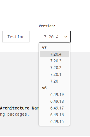
Where can I find download links to older versions? https://mikrotik.com/download shows v6.x but not e.g. v7.19.6? I can see changelogs for older versions in the Changelogs section, but I can’t download the files anywhere?
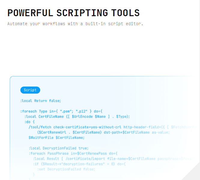
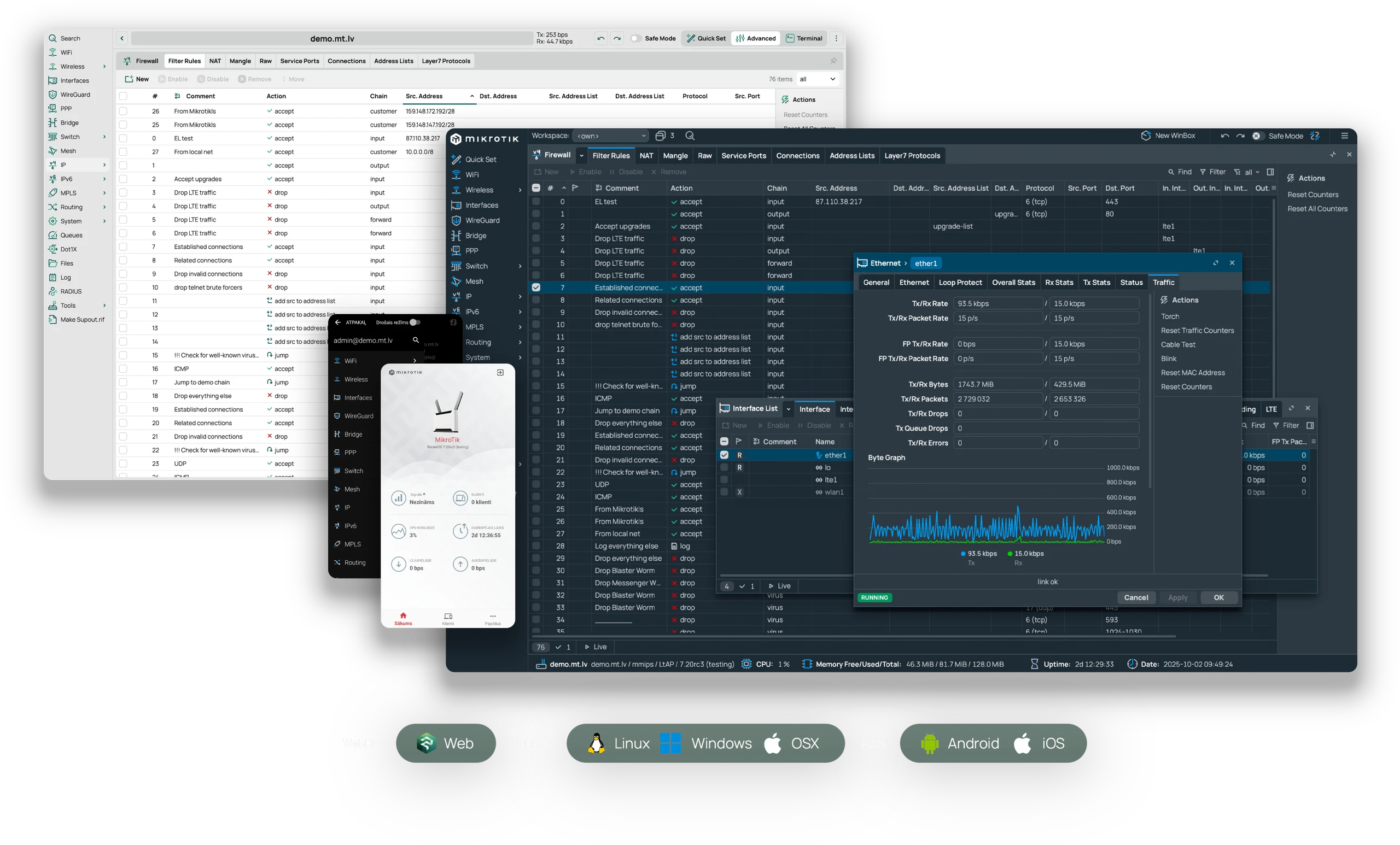
On the WinBox page we have this section:
Can the "built-in script editor" in WinBox (3 and 4) finally be updated to look like this image with a monospace font?
The gray font is too light to be readable when it is on the white background, and is also way too small to be easily readable.
Very likely this is intended because someone perceives it as cool and hip, but it remains hardly readable.
It's time to invoke Dukhat:
https://jdebp.uk/FGA/dukhat-on-foolishness.html
Is it intentional to mistype the brand name already in the forum thread title?
In my opinion, downloads section is “downgraded” since it makes finding and quick downloading packages nearly impossible. Instead of having 7 clicks for downloading updates for the hardware I manage, now I have to make approximately 12-16 clicks, not to mention going backs and forwards.
The style, as they say in German “gewöhnungsbedürftig” - can get used to it. Everything new is first not so good, but in time, the eye and mind gets used to it. However, I agree with the readibility of the font and would suggest a little more “weight” on the standard text font.
While noting the good reason to ‘keep up to date’.
I run >120 MT’s in a campus, and firmware management is important, currently running 7.19.6, nothing 7.20.4 is available. So having access back a few more versions would be most beneficial…
I noticed when for a brief moment I got a 504 error trying to visit the site, and I thought hey they have introduced random website failures just for fun, but nope a new look.
Hmm, not a fan of the extremely small font size in some of the text, on Mac OS running Safari on a 4K 32” monitor …
Just my initial thought …
//Anders
This feels like a step back in time. The choice of a monospace font is strange and is needlessly thin or small in most places, making it difficult to read.
The new website looks very nice.
And as requested few feedback/comments hopefully of use:
WCAG 2.2 AA compliance - I would recommend the front-end team to carry out a WCAG 2.2 AA audit per Directive (EU) 2019/882 (European Accessibility Act). This helps both accessibility compliance and aesthetic, as compliant front-end provides better navigability and contrast.
For example, currently in the footer area the background is #808085 whereas the foreground is white, translating to a contrast ratio of 3.92 which is below the required (in Mikrotik’s case, I would call this recommended) value at 4.5.
Enforcing (or following) this as best practice on documentation and static assets could also make the teams’ life easier when similar legislations are required in other markets, for example, where Section 508 / ADA is required.
Per the refreshed branding guideline at https://mikrotik.com/logo, the minimum font-weight to use for JetBrains Mono is 300, however on current website lots of text are rendered at 100. Combining my suggestion above, I would recommend to set the minimum font-weight to 300, or even 400, for better contrast and readability. Personally I think the site still looks amazing when is set to 300 / 400.
Also - Mikrotik logos positioned at branding guideline page’s top-left and bottom-left corner are linking to /logo but not / , which doesn’t provide route to go back to the main website.
I noticed some of the static image assets have been optimized to webp, which is excellent, however there are still some really large payload such as https://cdn.mikrotik.com/web-assets/website/assets/widgets/info-carousel/about-slide-history.png from https://mikrotik.com/hardware which delivery hasn’t been optimized - should be an easy image transfrom task and suppose I’ll leave this to the CDN team.
One of the common critisim of Jetbrain Mono is it’s defaulting the 0 varient to zero-with-dot. On everyday usage it doesn’t matter too much, however in Mikrotik’s case, where mainstream product names often consist of multiple zero(es), such as CCR2004, RB5009, as well as the RRP, I would recommend to consider using the plain-varient zero instead, at least for product names and RRP associated.
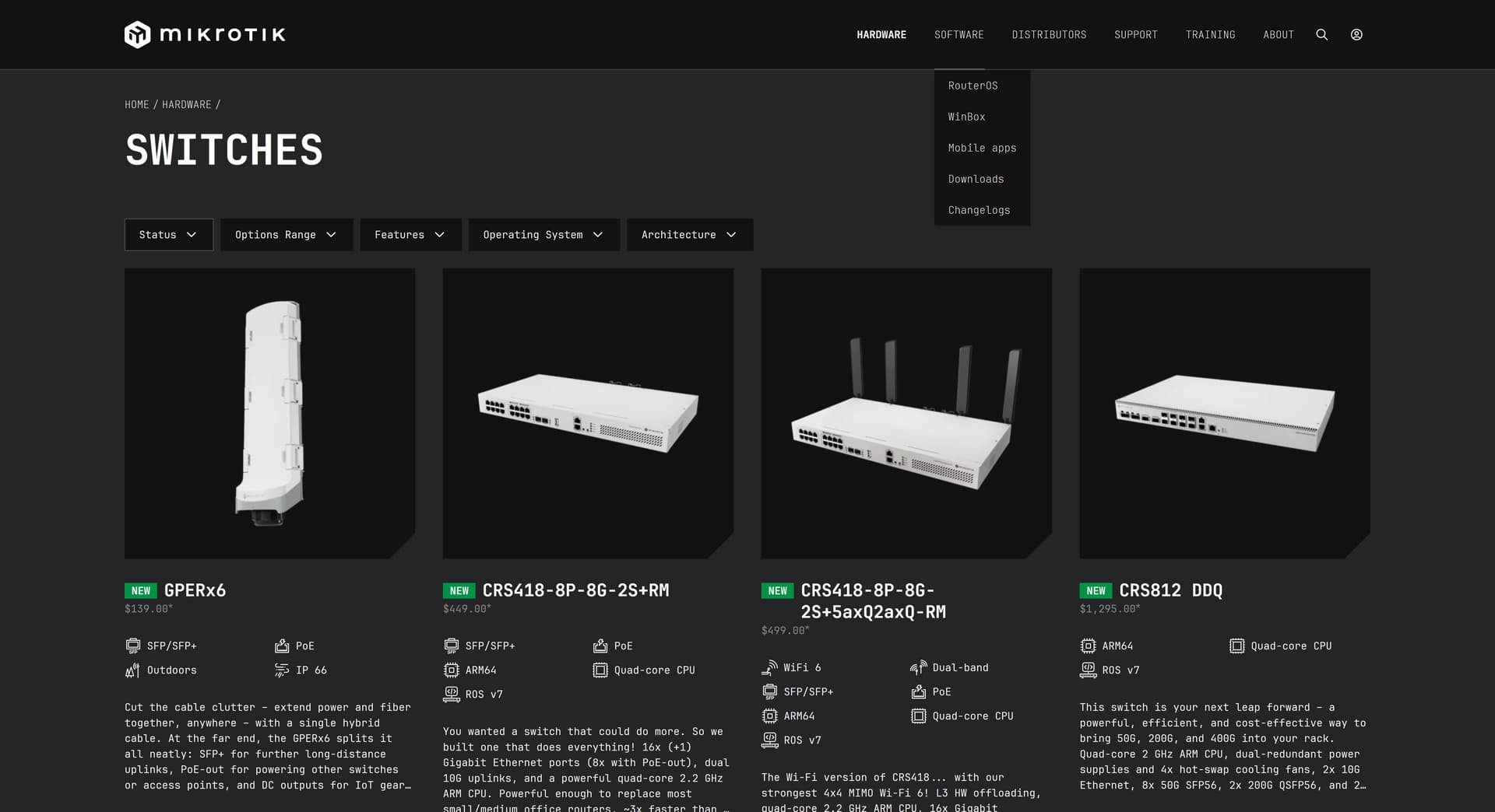
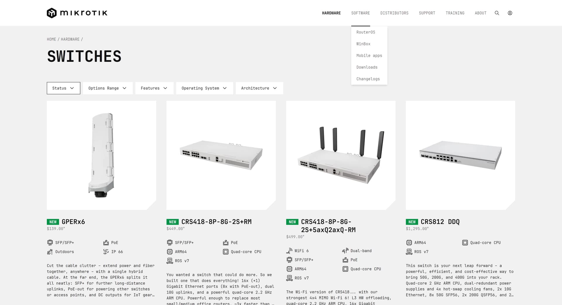
A nice to have but definitely not compulsory - dark mode. I had a look with #enable-force-dark on, and because the existing front-end is well designed and modern, the website looks pretty good thus I think it wouldn’t cost a lot to have dark mode properly implemented.
The dark mode, like what’s available on the forum, would also be more user-friendly to professionals, which should forms a majority of Mikrotik website’s user demographic. And by offering dark mode, products on the the products page would stand out more, due to majority of Mikrotik’s products are with white finishes.
For this I have attached 2 screenshots for comparison:
Few misc. pages haven’t been ported, such as https://mikrotik.com/notifications, but presumably it’s on the to-do list.
On https://mikrotik.com/software/legal, recommend to re-visit the validity of all URLs, so all URLs can be uplifted to https:// as much as possible. At the very bottom, “this software is based in part on the work of the Independent JPEG Group jpeg” might be re-worded as “This software is based in part on the work of the Independent JPEG Group: jpeg”? (No idea the legal language, but looks like missing the dot in the end)
On https://cdn.mikrotik.com/web-assets/website/assets/images/router-os-comp.webp, the latest official reference of OSX should be macOS instead of OSX (for example the reference here https://mikrotik.com/winbox is correct). Also I think it would be great if we could do something on the Winbox’s version, as it is currently showing 7.20rc3, which neither in the stable branch, nor the current testing branch. My personal recommendation is to use a main stable version here, e.g. 7.20, not 7.20.x and update this regularly with 7.21, 7.22 etc. - which should be a good balance to avoid updating this every single time if there’s a x.x.x become available.
https://mt.lv/MT_profile might needs some update (and re-branding as well) - as we are approaching 2026.
Likewise, some products photos could be re-taken in a more modern & professional way, such as all the RB images at https://mikrotik.com/products/group/routerboard.
From a design professional point of view, the new website is very well done and there are lots to learn from. And overall these are all minor issues, which could be ironed out as time goes by and hopefully I’m not being too harsh!
Something small, not sure if it is related to the new website
Questions I have:
You probably know those tools that give output like this:
The Verdict 4/10 - Functionally adequate, experientially forgettable.
MikroTik makes sophisticated networking equipment but presents it like a 2010s corporate brochure. The site works, but it doesn't work for users. It's organized by what the company wants to show, not what customers need to find.
Immediate Fixes (If Anyone's Listening)
The design isn't broken, it's just... asleep. Wake it up or watch competitors with better UX steal your customers who "couldn't find what they needed."
Bottom line: You can have the best RouterOS in the world, but if users can't figure out which router to buy in 30 seconds, they're going to Ubiquiti's website instead.
For sure it is a nice visual refresh.
I am not able to find the download archive. Perfect is the changelog section, it is very clear.
Sorry normis. That line of argument raises the hackles. We are not MicroSOFT users, we don’t need to be kept in a padded cell. We are adults, we can make our own judgements. For all kinds of legitimate reasons, people will want access to all versions of Routeros.
I am on 7.19.4 and pleased with it. If I introduce a new device, I might go with 7.19.6, because we know there are issues with 7.20.x. If I felt bold, I might go to 7.20.4. But only if I can see a downgrade path to 7.19.4. If someone wants to upgrade a very old device, I think that Mikrotik may even have taken away the stepping stones to do that.
By not including all versions and treating your users as grown up, Mikrotik is giving a huge disincentive to try and take up the upgrades you want us to have.
Please, Mikrotik, restore the full archive
If you are not a Micro$soft user as you say, you would have found that the archive has not gone anywhere and the files are also available to those who know where to look. It is not obvious because for most regular users, there is no need to use old software, like I wrote.
Please, normis. I never knew where the archive was, but I could always navigate to it. Now I can’t. Can this be fixed please?
@Ductview
All available releases are on display in the cellar, in the bottom of a locked filing cabinet stuck in a disused lavatory with a sign on the door saying ‘Beware of the Leopard.”