Finally, we can pickup where we left off in IX deployment and hope we can use our few dozen of MT gear as supplemental to the existing infrastructure, if only this is available last year we are not in the current predicament right now that we are mixing platform in DC.
@MT please next in your roadmap should be as follows
QinQ, VXLAN and MACSEC offload in hardware, Openflow,VPDN and 802.1ah-2008 if this happen MT will be a household name in DC
If you refer to “filtered” by routing filters then there is no difference filtered or not filtered, total route count stays the same in both cases. And it does not makes sense to display count of just part of the routes stored in the memory.
.
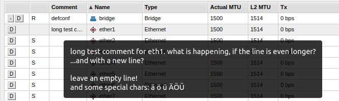
Actually we have asked, earlier on this thread and on the 7.9 threads as well, to have the OPTION to choose inline or “newline” comments, just like the winbox has (and always had) the option to choose which one the user prefers.
For those working on big monitors/resolutions, I agree that inline comments might work great. But for the laptop users, like me and A LOT of others, the inline comments are really bad. We even had people reporting that manages MK boxes, using webfig, from mobiles, in which it’s even worst!
Since the introducion of the FORCED inline comments on the webfig, we have asked, actually, the ability to CHOOSE which one to use, and not THIS or THAT being force-choosed for us
As you can see from other commenters, who like it … This is a matter of taste. How is “left aligned” in your big monitor not wasting space, but centering is wasting space? It is the same amount of wasted space, just in a different place. Do not use webfig in a maximised window on a ultrawide.
But because comments are now inline, I have no choice but to widen my browser to see longer comments. The problem isn’t a matter of taste when comments exceed 10-15 chars. It’s a matter of usability/readability.
I gather the vast majority of webfig users don’t use long comments. The problem is enough of us do. For me, I use them a lot, particularly in routers where I have a lot going on and use them to remind myself why routing filters or interfaces are configured the way they are, and in some cases, I even store tidbits of filter “code” in the comments for comparisons or for backup/emergency purposes.
With the comments now inline, the bulk of the information is cut off. In order to read them, I have to click on the line(s) I want to read.
In the name of aesthetics, this ends up creating more work.
Similarly, but to a lesser extent, centering and grouping everything requires more eye/mouse travel, and obscures information that was previously immediately visible. For example, I frequently check 60GHz AP’s for station status (why isn’t there a separate table for 60GHz radios? And why isn’t the name or MAC of the CPE associated with their signal strength, etc.?). With everything hidden under “Status”, I’ve got to click more times to get to what I need.
I know this may come across as silly to some of you, but when your daily workflow is impacted by UI changes like this, these little things tend to add up.
Of course the problem is that webfig has no options at all. To have an option for such a thing, first the development has to be done to have options.
Once that is done, of course it would be trivial to have an option like on winbox. And lots of other options as well, such as selectable colums/width/order, hide/show password, etc.
But to add that to an in-house-developed web framework can be somewhat of a job. I think it is more complicated than implementing BFD.
I don’t understand exactly what you guys are complaining about. When you open a table with comments you see the truncated comment, and when you hover the mouse over that it expands into the full comment in a separate pop-up.
Why do you have “no choice to widen”? Does this mouse-hover not work in your browser? I use Firefox and it works there.
It will be a great day when we can rely on built-in/native robustness of this and I can delete these scripts
Actually I haven’t tested if the functionality has changed since early v7 betas (as my script works well for me so didn’t need to check), so it would be good to have an answer to OP’s question for better clarity
And while commenting, I want to throw in my 2c that inline comments are awesome, so rather an option should be provided in webfig to select preferred option, than revert to old style…
As much as I love winbox, it would be great if someday winbox and webfig are visually and functionally equivalent. This would preclude a need to develop a new winbox that is compatible with MacOS for instance, as we could all use a web app as a replacement for winbox. But right now there are still too many issues with webfig so I always use winbox where possible
I said “No choice but to widen”, as in, I have to widen my browser window, in response to Normis’ statement to not widen the browser all the way on ultrawide monitors.
I was not aware of the tooltip, but that’s still an extra step to see stuff I’m accustomed to seeing right up front. Tooltips aren’t really useful on a phone or tablet, where I use webfig a ton, too.
Again, most people won’t notice/don’t care about the inline comments change, but when you’re in and out of dozens of devices per day, trying to troubleshoot problems, comparing settings, routes, results, etc., any extra work required to find the information, be it mouse-overs or extra taps/clicks or drilling down through menus is time taken away from getting the work done, solving the problem, and restoring service. Every fraction of a second counts.
One example is the DHCP lease tables. I have scripts that go through each of my edge routers (20ish at present) and makes current leases static for use by UISP and traffic shaping. Sometimes I have the customer’s full name in the comment field, but more often than not I pull the hostname from the DHCP request. Every single comment entry exceeds the column width, so I see 10 characters out of 20-40, whatever it is. Sure, I can widen the columns or mouseover, but I have to do that for each of my routers. And what might work for my desktop is too large for the laptop and way too much for my phone.