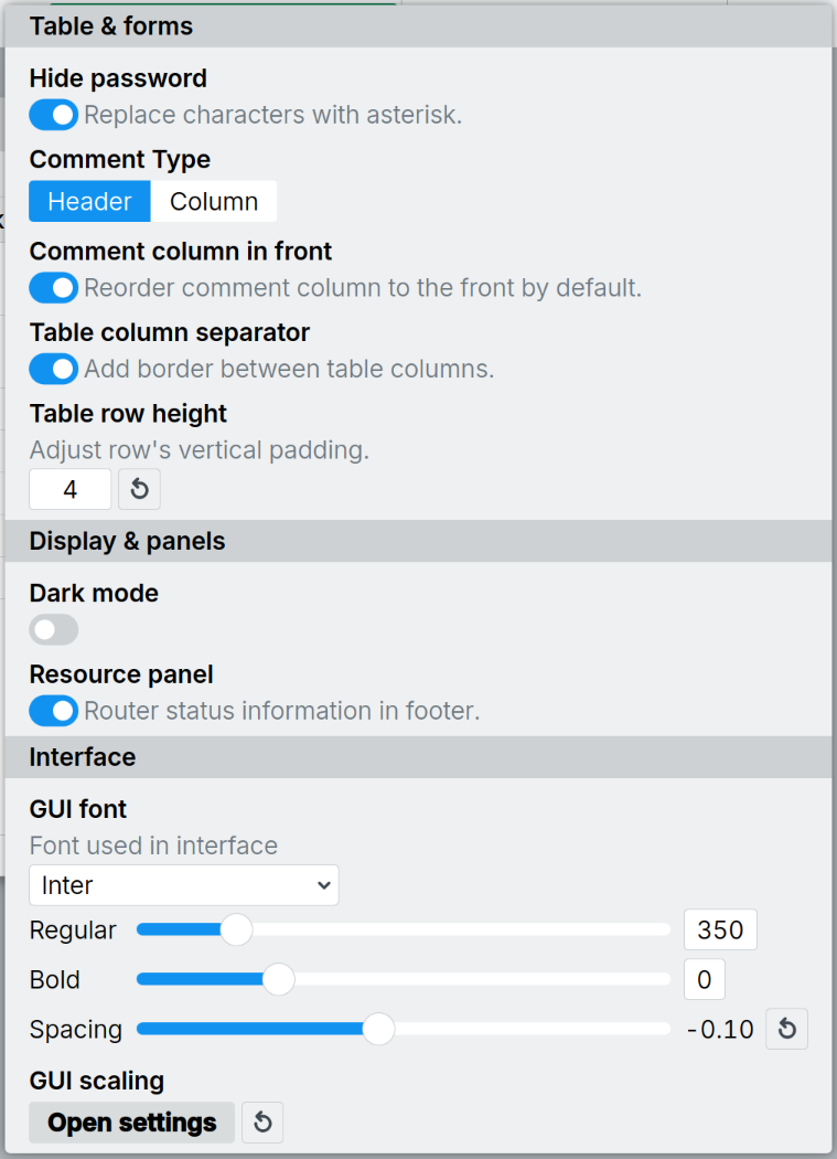
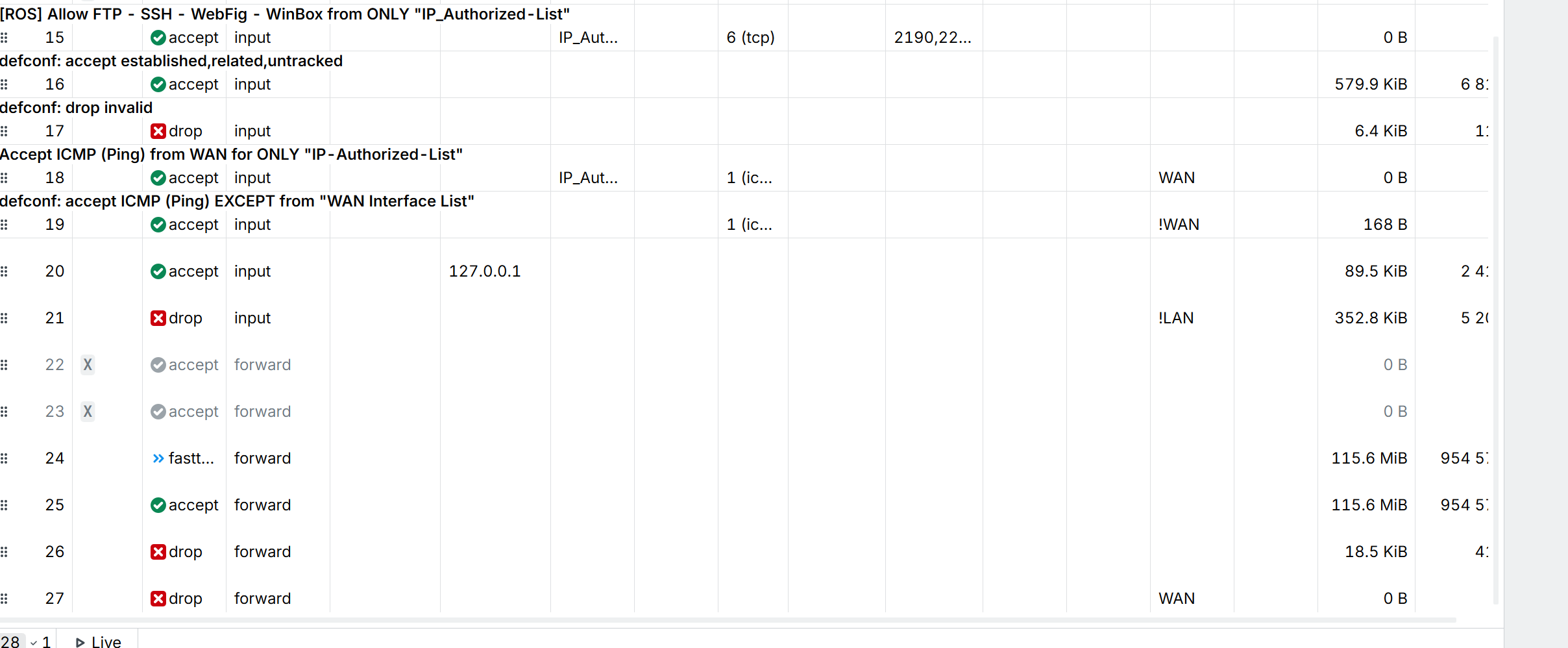
I wish the person who approved the design had the same gaps between the teeth as in Winbox 4, in rows and columns. Is it really that hard to recreate the old design in a new engine without these ugly, unnecessary tools and ugly, awkward design?
You've received so many complaints about 4.1, and in all this time you've done nothing. No comment. Remove this customization and return it to the way it was in v3. If Apple users like this pathetic design, then keep this disgrace specifically for them.
Please enhance that so password and workspace are optional args and WinBox can be auto-connecting to a saved entry without presenting the "Connect to" screen.
Maybe as WinBox [options] connect-to or maybe with a specific --connect option.
Can Tik remove the "assets" folder? I have the .exe on my desktops and with each update that "assets"-folder with only the WinBox-logo is created. Never asked for this, but get it everytime... o_O
Ok those do not work here anyway because the user running WinBox has no permission to overwrite the executable. So I download new versions myself and unpack them.
Probably no one at MikroTik uses Windows on their PCs anymore and have no idea that the Microsoft PE executable format, since decades, have standard sections for embedded resources, such as the icon. The assets folder with the separate PNG logo file is there only to address the shortcoming of Linux's ELF file format and should really be removed from the Windows version.
It is good they provide a logo, I used it to make a nice shortcut to the program, but it would probably be better to provide it as a separate download instead of putting it in the zip file. And indeed, for Windows it is useless.
Don't know if it's a bug of WinBox 4.2 but on ROS 7.21.5 LTS on AX2 the latest rules are not shown with the inline comment, even if it is present when opening them individually and they appear regularly from Winbox3
What is the purpose of this customization in the settings tool? v3 was minimalist; it had convenient “colored menus,” a normal scrollbar, the ability to hide windows “to the left,” “single-column” settings, and additional menus and tools located at the top of each window rather than on the right, among other features. It weighed in at 2 MB and was way more pleasant to use than this piece of junk. I honestly don’t understand how they didn’t fire the person after the first v4 presentation.
I just don't get it—was it really that hard to simply replicate the v3 design on the new “engine” and add new tools, instead of completely reworking the design?
You can keep whining forever about companies following the "modern trend of GUI" but that will not help. Releasing a program with "old windows look" at some time will backfire on them (you will see "the config tool looks archaic" in all reviews), and also they (at least now) use standard a toolkit for the GUI which will move on as well.
I'm glad they heard some of ours and mine complains.
I haven't used extensively, but so far this version is faster, not that sluggish behavior which made winbox practically useless.
Romon still has issues when you check "open in new window" and trying to connect to a romon neighbor. It fires wrong username or password. When unchecking "open in new window", it opens correctly.