Thank you for the new release. For i3wm there is one extremely annoying behavior - disconnect button should quit application. Do not open connection form. For this purpose there is a "Open new" button. Most of desktop application have "Exit" button that close application - chrome(close last tab), libre-office, mousepad.... "File => Exit".
That's a problem of your window manager. Other "normal" WMs / OSes already provide a standard and familiar close button and I don't think WinBox should duplicate it. The current "Disconnect" button is quite useful for quickly switching to other devices without cluttering the desktop with unused windows. If we implement your idea, then this workflow becomes very cumbersome, we would have to hunt for the previous window to close it after the new window popups. That's at least 3 more mouse clicks and long mouse travel distance (assuming the taskbar is at the bottom).
I partly agree with your arguments, except the app closing button is imho basis of the UI. App should be independent the user's desktop environment - shoud be able to close by itself. Also, in most of situations, the user wants to open new winbox session side by side - not closing one and opening another. In winbox3 there was a "New winbox" and "Exit" like in most desktop app in this world.
I'd rather keep the current functionality of the disconnect button, though I agree that something like Winbox 3's "Session > Exit" could be useful in some cases. Session > Disconnect was also an option in WB3 and works like the current disconnect button.
Perhaps "Exit" could be added as an option in the gear icon dropdown below "About".
Yes, "modern" != "better".
Windows 11 is "modern", yet awfull to use.
MS Office ribbon is "modern" (for almost 20 years now), but I still hate it (and use LibreOffice instead).
Winbox4 maybe looks "modern", but WHY did they have to move EVERY UI element to another position?
CPU/RAM/uptime moved from top right to bottom left? WHY?
Actions moved from top row near Add/Remove/Enable/Disable to right side to take space for at least two more columns? WHY?
Windows that change vertical size on tab change? WHY?
Side menus in multiple columns and you cannot know where will you find desired option? WHY?
OK, I like the possibility to change fonts (Roboto Condensed is great btw) and more zoom levels, but there are soooo many bad decisions. Why couldn't they just copy the old layout???
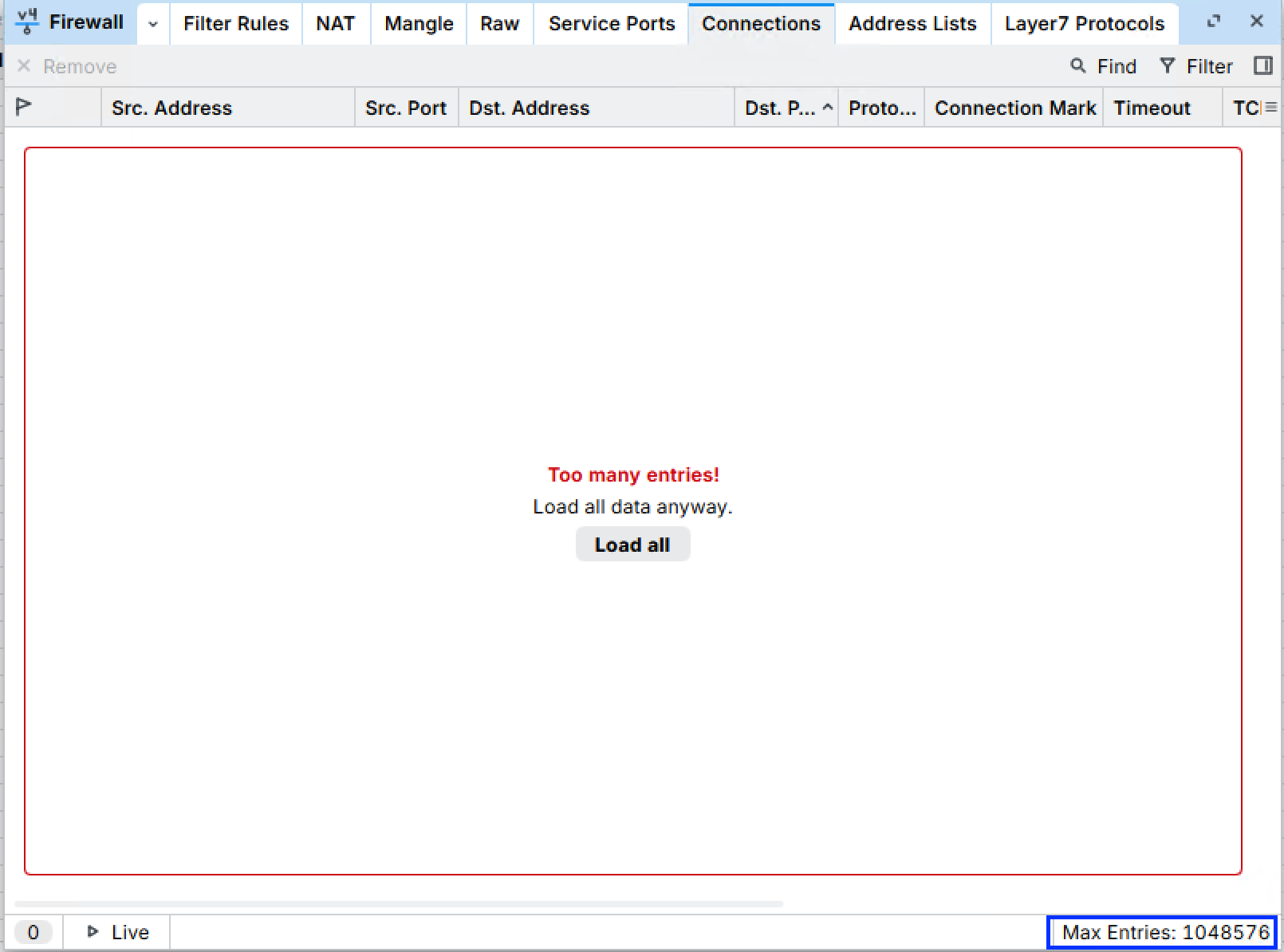
And still the same issue for me with missing entries in tables on Windows11 on ARM 
Is this working for anyone else by now? At least I still have that issue on 2 laptops. (Snapdragon X and a Snapdragon 8cx G3)
Please add passwordless login with passkeys to new winbox. It’s will be killer feature and give us much more safety
Please add an exit button on the left side, like in winbox 3
+1 !!
You turned on the Aladdin light bulb for me, in the screen I was with a Microsoft Surface 10 with Windows 11 and now with Kubuntu on an x64 I see all the normal comments!
Thank you. I want lo leave a small suggestion: please update win box window frame to new Mac OS style (26+), almost all apps is already updated, but this awesome app looks like app from Mac OS 15. Again Thanks!!
It takes a long time to connect!
I can't explain exactly why...
But in all the tests I ran using Winbox 4.2, whenever I connect to any device, the screen stays stuck on the "reading index file" message for at least 8–10 seconds (when it's fast).
In many cases, it takes over 30 seconds.
And unfortunately, I think I've discovered there's a 60-second timeout before Winbox declares the connection attempt a failure.
In my daily work, I commonly connect to 20, 30, or even more devices.
With Winbox 3.43, connecting to devices running up to version 7.20 (roughly) worked beautifully.
Since the later version 7 releases (I think anything above 7.20), opening devices with 3.43 has become a challenge... The vast majority get stuck in a loop where they open, load a bit of information, and then drop the connection...
And with version 4, the Winbox "reading index file" issue has become unbearable.
To wrap up: in version 4.2, this "reading index file" delay seems to be even worse.
Deaming with a Winbox TUI!
With clicks, ctrl+c/ctrl+v...
Probably your "devices" are "free" CHR instances? I noticed that over time connecting those has gotten slower and slower, this "index file" is large and the device limits the transfer rate to 1Mbps so it takes some time.
With "real" devices connected to ethernet I see no issue. Of course when your device is behind a slowish connection you will see the same thing.
Old winbox versions kept a copy of those index files on your computer, so I did not have to download them every time. However, that became a mess as every version you ever logged on to had a separate index file in that cache, and it was never expired (cleaned).
My contribution:
First of all, I personally love Winbox 3. It's "raw," and especially the "Windows 98" style I like when it comes to routers. That's why I initially rejected the new v4 graphics and am still praying for an ESR v3, which I actually found on the forum. With the release of version 4.2, however, I've promised myself I'll actively use it on both Windows and Linux.
- I think this applies in general; give users options, just like you did with fonts (which, by the way, is a great way to customize the interface). For example, the status bar where CPU usage and time are displayed can be positioned at the top, like in v3, and at the side, vertically.
- Add a CPU usage graph to the status bar, making the parameter "live," for example, green/yellow/red depending on the load. This is a great way, especially for remote connections, to see at a glance whether you're still connected to the router board or not.
- One thing I'm not too keen on is the "action" side menu. I much prefer v3, which has all the commands in the top menu. As requested in point 1, give the user a choice: whether to keep it as it is or as I'm requesting.
- Use colors a little more: "running" states are green, a non-serious warning is yellow, and a serious warning/error is red. Also make the "Apply - Cancel - OK" buttons graphically different.
- Please restore the "Comments" button in the windows menu. Now I have to go into each RouterOS element to add a stupid comment. With v3, I can stay in the screen where I see all the elements and there is no additional "Comment" field in each window. Again, see point 1: add options, don't make decisions for the end user!
- Why not make the comments for any element appear on Winbox with a thin yellow line like this:
==== yellow line COMMENT yellow line ====
eth1
==== yellow line COMMENT yellow line ====
wlan1
I would find that really convenient.
7. In the left side menu of the commands, add two buttons: a direct link to the new RouterOS manuals site and restore a "New Winbox" button like in v3, as it is really unintuitive where it is currently.
8. Does Winbox 4 support skins? I didn't find anything on the forum that supports it. If not, please look into it.
Question: What's the "Live" button for? I was afraid to press it because I'm abroad and don't have physical access to any router boards! 
Suppose you're right, and v3 has an "archaic" look, but ... v4 is ugly.
Let's just say that the person who designed the UI has no taste. Likely the developer who took the contract was the one with the biggest ego to promote himself the most, incl. here on this forum. 
[edit: ] I should add, the person who took the job has somewhat mastered QT with the sole purpose of becoming relevant in the cross-platform ecosystems, but is lacking understanding of the fundamentals of what makes UI useful. One needs to think different to design User Interfaces. Such virtues are innate to one's character, and have nothing to do with programmer's skills or knowledge of QT.
P.S. I can only imagine how much pain this "modern" UI causes to Apple users who are known to highly praise the style, ease, and efficiency inherent to Apple ecosystem. I guess Apple users are all so quiet because to them, there is no alternative.
[edit 2:] More work needs to be done. Specifically the designer needs to take a long, hard look at layout of controls in Winbox, and answer the question of why he split a single control surface into multiples, pushed into different corners. A designer needs to look at (and think about) the distance a user has to move the mouse (starting with seemingly innocent log-in window). Ask (and find answers) to questions such as what can be done different to be complement user's workflow. A designer needs to ask a lot of questions of WHY certain decisions in v.3 were made the way they are.
Finally, a designer must absolutely use an old laptop with 13" screen. Does it look good? Can you still use it? How about using it on a 10" tablet? This is a must to start seeing the opportunities for improvement. Unless a designer gives up a comfort of a modern 4K desktop monitor, he will not be able to make a good user interface.
I guess opinions and observations vary. I have never encountered a UI that I thought sucked harder that Apple . . . It's so dumbed down that it almost makes my ears bleed, and I find it completely coubter intuitive and massively frustrating.
I didn't care for WinBox3 much either (but likely due to loathing things Macro$hat).
Neither one has grasped that window raise/lower and focus are NOT the same thing, and should be trivially uncoupled (talk about wasted mouse movement!) but that's not an app thing, it's a window manager.
WinBox4, to me, is pretty close to what it needs to be. No "cutesy" bloat and useless graphics. The ability to see multiple things at once. Never thought that mouse movement was anything but negligible . . . . etc. Ergo "Works quite well for me".
Having said that, thoough, I tend to use WebFig most of the time since you can get it on anything with a browser (at least for simpler stuff).
(Now to start another likely $h1t storm . . . ) Myself, I like the leanness of the SwOS UI better than any WebFig!) It's lean, does what it needs to do, and doesn't waste resources.
Frankly, the fonts, color scheme, etc. of WF4.? is right up my alley, and works well on my desktop. (KDE4, 4 shell windows black with turquoise text, Brave and Thunderbird for mail.
I loathe white background! Gives me sore eyes very quickly!
@tadawson, there is a reasons why standards exist. Winbox 4 breaks them.
Specifically, Winbox 4 breaks the standard Windows GUI established over decades.
As a food for thought, I suggest you get yourself a "modern" car from futuristic manufacturer, then calculate total annual cost of ownership of your "modern" gadget on wheels that came with latest and greatest bells and whistles. You will soon realize that your old "archaic" yet simple car (which does not break established conventions) is a dream you wish you could still have.
Same goes for User Interfaces.
The good old UI takes you from point A to point B without forcing you to bent backwards.
Regardless, I appreciate your Winbox 4 experience.
Whinduhs a standard? Bwhahahahaha! More like an abomination!
Doing things almost as stupidly as possible (an award reserved for Apple, but MS is a contender) hardly defines a "standard*?
Perhaps it's my career being based on commercial nix (Sun, HP, SGI, Motorola, and a few others) and Linux . . . never found a use for Win anywhere (or had it in the house . . . )
And I'd love to know what you find so awkward in WB4? I find it very efficient (although if you are looking for wizards and crutches, I acknowledge the absence.) Myself, the access to everything with nothing being forced is a huge strength . . . other brands have typically frustrated me massively by forcing some developers ideas down my throat and making what I want to do close to (if not at times totally) impossible, and I hate that.
Re: the car analogy, WB4, to me, at least, IS the old car - a knob for everything and none of the cutesy screens, awkward forced workflows, etc. I get to use it soley how I want to. The overall "look" is no more relevant than the old wood dashboards and vinyl roofs were . . . (And also why our cars are 2001, 2011, and 2015 . . . )