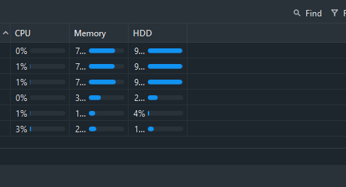
Would love to see it when filtering in WinBox results in the filter being sent to the router, and only results matching the filter are retrieved. That is at least possible in API and I guess it would be possible in WinBox connections as well?
This is especially useful in situations where the observed table can have a lot of rows, like the routing table or the firewall connections (and sometimes filters as well).
Some bugs i've noticed have been fixed, but was this really a worthy 4.5 release?
The expanded toolbar section i'm in favor of. But i'd have liked to see some bigger features and QoL adjustments, such as the ability to pin windows always-on-top, minimize windows, tabbed winbox sessions, snap windows so they move/resize together (perhaps with a modifier key, would get annoying if its by default) custom theme colours etc
This seems more like a 4.4.1 release than a major update
Thanks for updating the buttons in the Tools menu. It works for me this way, but I might agree with others in the beta thread that it would be nice to have an option in the settings to choose whether they should expand into the top bar like this or remain in the “Submenu” list.
But for the next release—please add a “Show categories” delimiter function like in Winbox 3 . I need this when dealing with multiple DHCP servers, etc.
And here’s an idea—could you add a “Hide passwords” button directly to the settings icon? As it is now, I have to make one extra click compared to Winbox 3. Or better yet—it would be great if there were a “Temporary Show Passwords” button that would automatically turn off after closing the session or when the timer expires.
Most of the time, I need to copy a password, like for Wi-Fi, for example. And I have to turn “Hide Passwords” off first and then on again so that all my passwords aren’t visible the next time I log in.
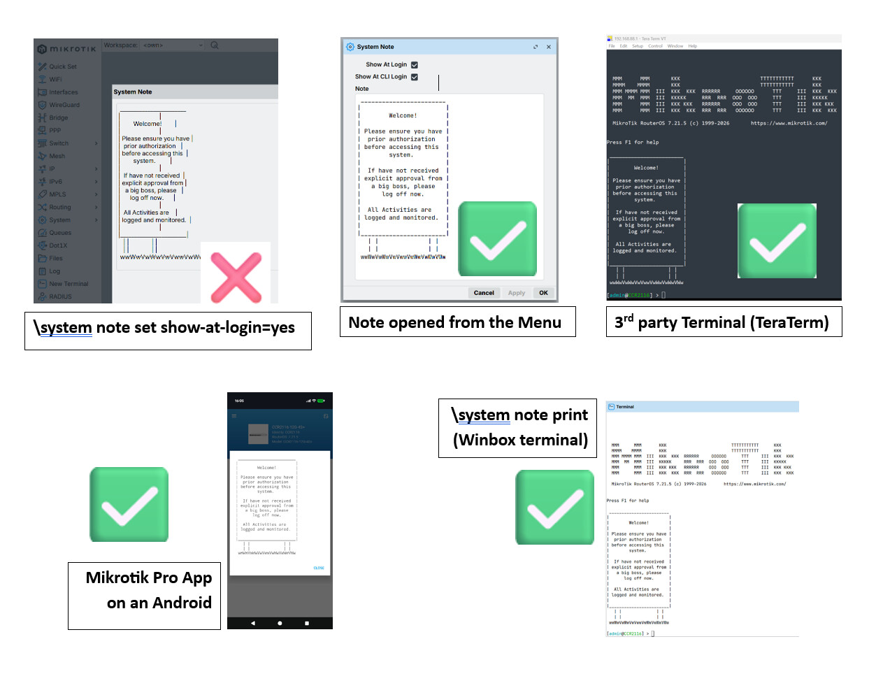
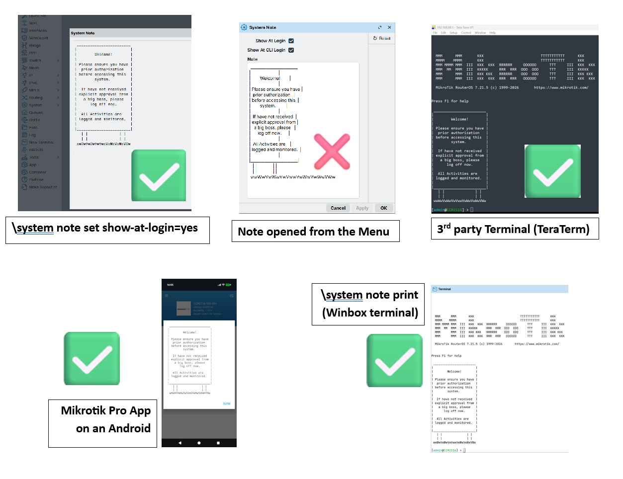
What is wrong with WB4 font rendering in Windows 10? I have not had Winbox on Windows for years. I remember WB3 was all ok. But just downloaded WB4.5 on my Windows 10 machine. These fonts look like frizz. I was always the opinion that best font rendering was in XP where you could still disable ClearType iirc. But okay, I have used Windows 7, 8, 10 and a little bit of 11. Overall I don't like how modern Windows hints fonts. But this Wb4.5 is out of competition. When I place Windows Explorer file listing right beside WB4, it looks like someone printed the WB4 interface with a dirty inkjet head which wasn't cleaned in years. How could anybody not complain or see this? I know it's suboptimal in Linux as well, but okayish. But on Windows it's a different level of frizzy fonts.
I changed font from Inter to Segoe UI. Now it looks like 10 times better. What an insane choice for default font.
winbox.exe -platform windows:fontengine=gdi
This even fixes it for "Inter" font. I mean I thought 4.5 is far beyond beta?! And you need to run WB4 with qt cli arguments to make it useable. Strange to make this software mandatory for managing 7.25+.
 . I need this when dealing with multiple DHCP servers, etc.