We have no plans for cloud based controller.
Joke… And this is reason why we and others are leaving MIkroTik for other vendor. Ya’ll dont take this serious. I feel like MikroTik has become a college side project, or a home lab approach. Perhaps we’ve outgrown MikroTik. But this is all due to RouterOS v7, lack of refinement along with the disaster of Wifi6. Now layer in Winbox4.
Winbox 4 style will not change drastically, I personally love it, and from a graphics perspective I think it is very crisp and readable. So it’s very interesting to see specific comments on what is not readable in your system. There are probably a million different screens, but if we are talking about “taste”, that’s not worth complaining about. Everyone has their own.
Really? Sorry, but from graphics perspective it’s a sh*t and absolutely unusable.
I have already described everything here, specifically in PDF. http://forum.mikrotik.com/t/winbox-4-is-here/178358/2020
Many people liked it, haven’t seen any complains about my proposals.
And it’s not about tastes. It’s about usability. USABILITY.
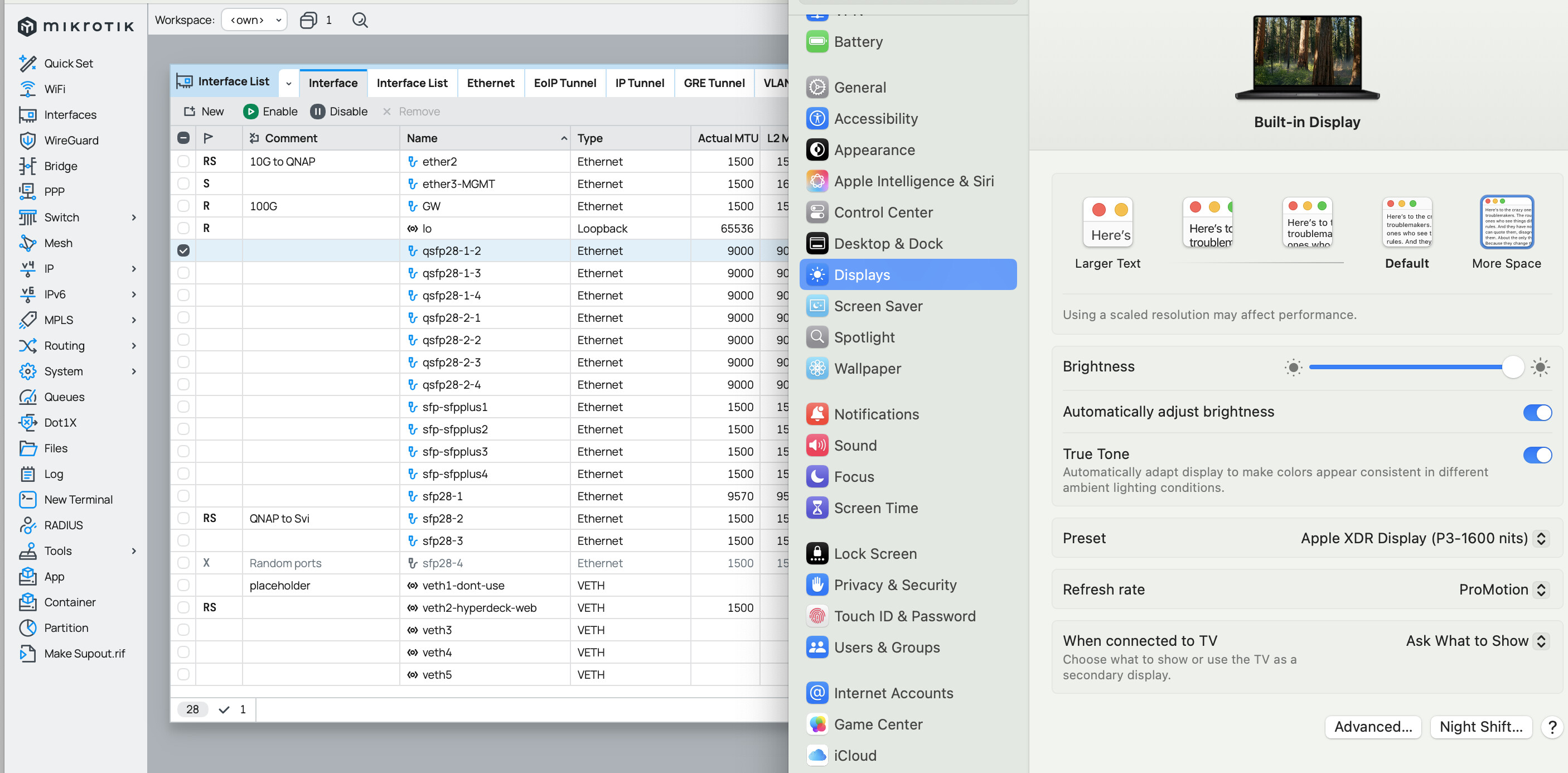
Normis, what monitor are you using? I use Macbook pro – retina, also dock it to a 2k screen. Winbox4 is NOT crisp. I still prefer Winbox3 running in Wine. The fact that winbox3 is visually better, contrasting buttons, layout and overall - better. You’re lying to yourself and the end-users - and future prospective customers who will say nope, and go back to Unifi.
The development work on MikroTik App for iOS was much better.
Kindly see to @Teslasystems approach and what he outlined. I’d actually compliment Winbox4 if MikroTik took some idea’s as he outlined.
Winbox4 at this stage is still Alpha.
Do your market research. Look at what other vendors are doing. Now knowing MikroTik has zero plans for a controller option… VERY bad taste in our mouth.
Cambium, Unifi, Meraki and tachyon-networks are full steam ahead with develpoment. [We been moving majority of new and existing wifi to Cambium, and then 60Ghz to Tachyon].
Yes, I have macbook pro as well, It is sharper than Winbox3 was in Wine. Could it be a custom resolution or different scaling?
Now knowing MikroTik has zero plans for a controller
hold your horses, I did not say anything like that!
To put in perspective on how bad we feel the current MikroTik landscape is… with Winbox4 and the lack of QC on software releases on your own hardware.
We are a client sample of ONE, however as a small MSP and who deploys wifi to campgrounds and other sectors… we are no longer using MikroTik for new customers. Not until things improve and we regain confidence…
If we are sample size of ONE..and we feel this way. I am sure others are feeling or will share the same sentiment… they also will look the other way… slowly lose existing loyal customers [we were for 15 years]. Times are changing and other manufactures are doing it better. We can buy Cambium at very similar prices to MikroTik with deal registrations and price exceptions.
Probably the reason why Cambium as a company is so profitable (not).
Same scaling I run. It may “look” the current glossy or translucent theme that operating systems are fleeting toward. It is the color shading, lack of contextual buttons – the buttons are just black text on the window. Scrolling still doesnt work right. in-line Comments look just text. Again, kindly see to what other vendors are doing for design idea’s.
**Or refer to what Teslasystems had outlined in the work he did with his presentation and his approach/suggestions.
OPNSense controller. Meraki Dashboard. Cambium CnMaestro.
We’ve done large deal regs with Cisco [Meraki] and they’ve come back and even undercut Cambium…
Well, Cisco wants to see a competitor die apparently.
But now this is getting really offtopic hete.
From info gathered in this topic, it appears cisco care about MT so much that they infiltrated their agent as a winbox developer to sabotage the new winbox.
Well, based on what WinBox has become compared to v3, it really looks like that 
My impression (under Linux with Xfce) is that the text is not black but dark grey, I want to change that to really black.
And also I want to change the white background to something a little darker (grey or a light color like yellow).
But I have not found a way to tune things like that, is it possible or is it all hardwired in the program?
We are following this topic, and many of the suggestions are already implemented. It is harder with suggestions that are conflicting or completely opposite with other people here. Also, the main priority is the functionality, not contrast (for now).
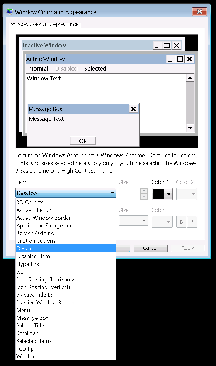
Making a separate settings window, where it will be possible to adjust EVERY element (like window background color, input fields background color, active/inactive window frame/header color, input field frame colors/thickness, text size/style/colors for every place and so on) will solve a lot of problems with contrast and colors.
If you don’t understand, how to make good colors and contrast, let the user to do it.
Similarly to how it’s done in Windows 7 for example.
.
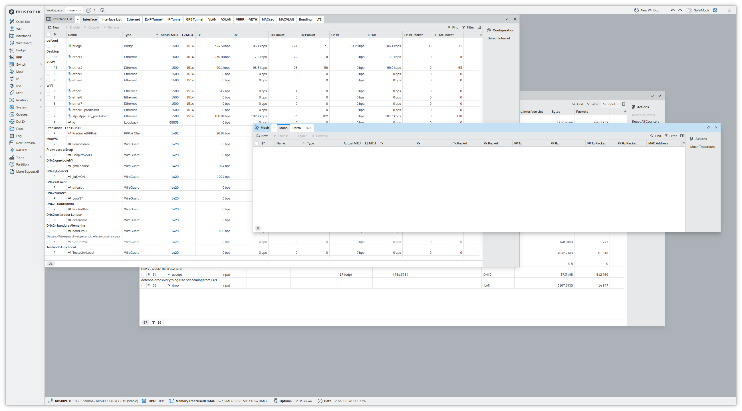
Attached my screen. Linux (KDE, X11), 1440p, 92% zoom.
The good:
- The readability improved leaps and bounds. I remember how bad it was, when it all started. That thin line delimiting the border on fields wasn’t there, for one.
- It does look clean, in the sense that there’s no clutter.
- Fonts looks quite readable, at least for me.
The bad:
- The color choice is a little too soft. I can see the difference between an active and inactive window - but I don’t work outside and have a decent 24" screen. It would be easier if the active one color were a little more bold.
- The lines delimiting the fields and cells could be more visible. I think a little darker, since the width looks ok to me.
- The lines delimiting the internal windows and tabs definitely need to be more thick. It should be obvious at a glance where the internal windows and tabs starts and stops.
- The shadow of the front internal window is a nice touch, but again: it needs to be a little more bold. Just a little.
- I know that “flat” designs are in vogue - but several usability studies show that it is a worse experience. We NEED to have some decorations, shadows and whatever to give us a sense of depth and borders. What I mean is: we have a FAR easier time interacting with an Windows XP interface than a Windows 11 - exactly because one uses volume and 3D and the other is flat. Understand that I am NOT asking for a Windows XP interface. I’m pointing out that having a feeling of volume and boundaries is a better experience than being flat.
Suggestions:
- Remember that Your users doesn’t drive a retina display on a nice office. They work on the field, with a small laptop display, usually cheap and with the sun hitting the screen. By all means, develop it on a retina display - but use a bad screen as control, to check how it will look on the real world.
- Our eyes get worse as we get older. I know mine did. Don’t just ask a 25 year old developer what he thinks about it - ask to a 60 year old too.
- I don’t know how hard it would be, but if possible having Winbox to follow the system colors would be nice.
- A third “high contrast” option (beyond “normal” and “dark”) would be great, for those who need it.
I just don’t get the level of vitriol - especially with the return of “dialog tabs” on top… I got my quibbles – some of which were fixed – but overall WinBox4 is coming out good - I use it everyday without any “real” issues. And “wine” had way more legibility issues than one-pixel boarder issues, so come a long way here…
On functionality…
-
More keyboard shortcuts!
-
With the “return of dialog tabs”… perhaps the tabs in dialog should also be detachable like the “main tabs” on /interface etc? Or, be allowed to bring up multiple copies of SAME dialog. It just be helpful to see the “status” part of same dialog, while perhaps changing settings.
-
Why not use the lovely JetBrain Mono in the /system/script source (and other “on-script” places)? MikroTik scripting language easy-of-use and readability is NOT helped by using proportional font…
Thank you for this clear input. However, leaves that feeling - that MikroTik is planning or internal road-map to push users to Winbox4 sooner then later [hence the Winbox4 functionality push, vs usability].
I prefer to have Winbox4 usability - fit and finish [polish] and then functionality - 1:1 or improved from Winbox3.
Finalize the design now, and then can bake in all the improved functionality. The later is you run risk of breaking functionality with introduction of UI changes.