Agree, there should always be a on-hover text explaining the function!
Please make posibility to choose in Winbox4 to look same way as Winbox3.
In total winbox4 gui is less contrast than Winbox3 . it will be good to have posibility to configure themas
Please add posibility to avoid gui components rounding. it is really annoing. In general interface of Winbox4 look like huge wasting of screen space for Buttons and useless gui elements.
Please decrease vertical space between text and table lines or please make it configurable.
Please make inline comment settings separate for router configuration UI and for Initial connections list
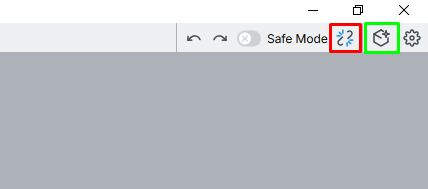
Yeah, X button is also here...
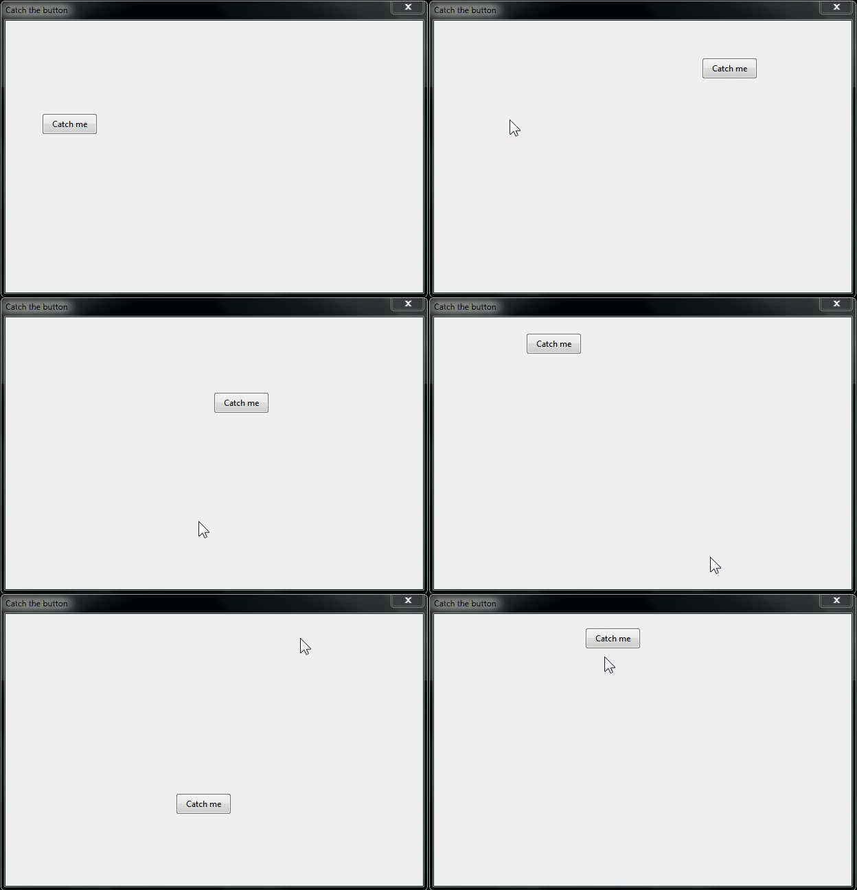
It really looks like some student is experimenting on us with some crazy layout ideas, starting from placing frequently used buttons (Undo, Redo, etc.) in the top right corner, ending with jumpy +/- buttons, that play "Catch the button" game with the user.
WinBox 3 was made by smart people, just follow it and don't reinvent a wheel. By doing that, you are not only ruining user experience, but also putting multi-year work of those people into trash.
The game is called " Whack-a-Mole"
I meant this game 
I knew that 
There is no conspiracy or bad intent behind this. It is simply a lack of expertise or experience.
That's why I'm saying to just follow WB 3 layout. Though, it was said multiple times by others in this topic and still almost no result.
And I doubt it's a lack of expertise or experience either. They make a few different design decisions, that's opinion, not incompetance.
It's a beta, so they do seem to be "trying" concept out. To then change them in a future version.
And that too is an opinion. There is an counter-arguement that a new version, should actually have new features, not merely exactly mimic a 10 year old Windows app. Given they've go down the full-fidelity to WinBox3 road, @teslasystems opinion largely won given were down to icon placement.
If MikroTik were in Silcon Valley, they'd have already shipped WinBox4 and moved on to a new controller long ago, given the later likely impacts sales more. So we're lucky they care enought to even still trying to refine WinBox4.
Placing disconnect next to make new window. this is not opinion. This is just a bad placement.
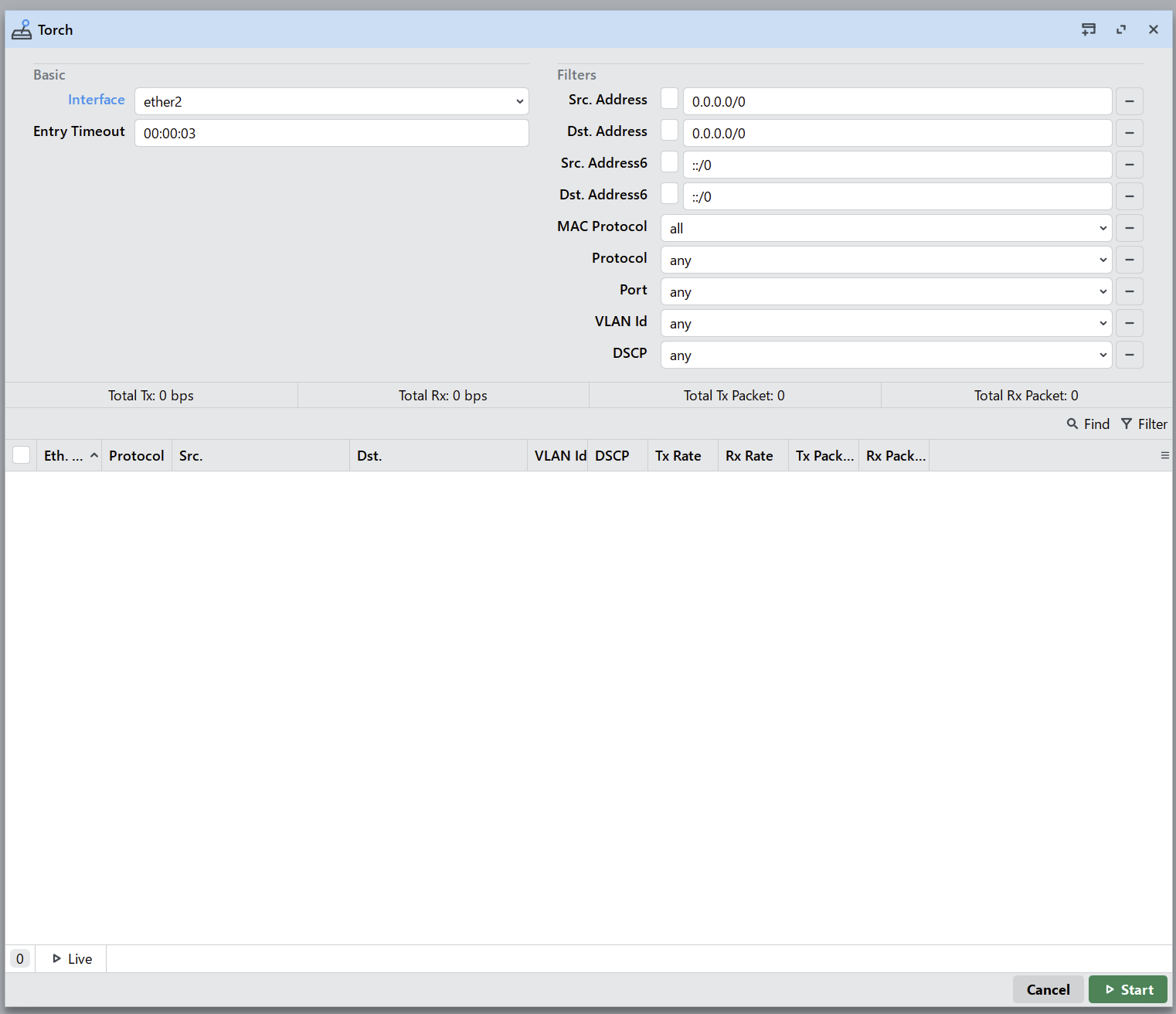
Regarding the status bar, that show a play icon next to "live". It makes me think every single time. And one of the top design principles is: don't make users think.
Same as placing start/stop button at the bottom in the Torch tool for example. When you change something and restart it, you need to move the mouse many times up and down from one edge of a window to the opposite, instead of having everything in a single area. It's not just an opinion, it's really bad design.
 .
.
Miiiaaaoooo???.....
For anyone else having the same problem, this should install all the missing dependencies on Debian/Ubuntu:
apt install -y libxcb-image0 libgl1 libegl1 libfreetype6 libfontconfig1 libxkbcommon0 libxkbcommon-x11-0 libxcb-icccm4 libxcb-keysyms1 libxcb-render-util0
If possible, it would be good to make folders and subfolders for the added sites on the DNS -> Static tab. When there are many addresses, it becomes difficult to read and manage the list. A mess begins
Quite an eccentric idea to be considered by MT.
Consider that you can already organize stuff using the “Filter” feature, e.g. you can put a comment on each entry and then use a filter on “comment contains …”.
yes, but this is not very convenient and does not organize the list. folders would be more convenient
I’m guessing you are over-using the static DNS feature and it is a disaster waiting to happen…
Consider registering a domain for your organization and putting the records there, or using a local server that is more optimized to serve as a DNS server.