This was not working. Beta 16, Windows 11.
The solution was in same thread some posts further
Need to hover over the app on the taskbar and its small preview will appear above, hold shift and right click on this preview to show the Move option
Click Move and then press any arrow key once only, then simply move the mouse around as it will be tethered to the window and you should find it pretty easily.
Please make the setting for “inline comments” a 3-state: either not inline (separate line) or inline with the option to have it either at the beginning (as it is now) or at the end of the line (as it is in winbox 3) by default.
Of course one can always move it afterwards, but having to do that on all windows to get the same look as in winbox3 is tiresome…
v4 beta 17 is out
*) Table: Change to a custom font that has same-width numbers
*) Table: Align some number-based columns to the right
*) Table: Select the table’s first column as the default filtered column when adding a new row
*) Table: Focus the table filter’s first input field if the panel is opened by the user manually
*) Table: Add dropdown suggestions for saddress fields which accept an interface value (e.g., IP Route)
*) Login view: Add Uptime column for the RoMON table
*) Window management: Allow fullscreen with F11 and store/restore fullscreen/maximized OS window states
*) Performance optimization: Increase performance for large table loads a little
*) ComboBox efficiency: Improve performance for combo boxes with large data sets
*) Table selection consistency: Make the table selection checkbox size more consistent and accept a click on the whole cell
*) User interface elements: Update MDI title bar style
*) User interface elements: Update filter panel style
*) Form handling: Do not wrap login username and password fields
*) Window management: Rework how the OS window is stored/restored
To fix issues where the OS doesn’t automatically move the started app window within the desktop (Windows OS)
Store x,y of the window frame and the height/width of the content
(The restored window might have a small offset when upgrading from 4.0beta16)
*) Sensitive data handling: Make the “Hide Passwords” widget read-only and enabled if connected to ROS with a user lacking the sensitive policy
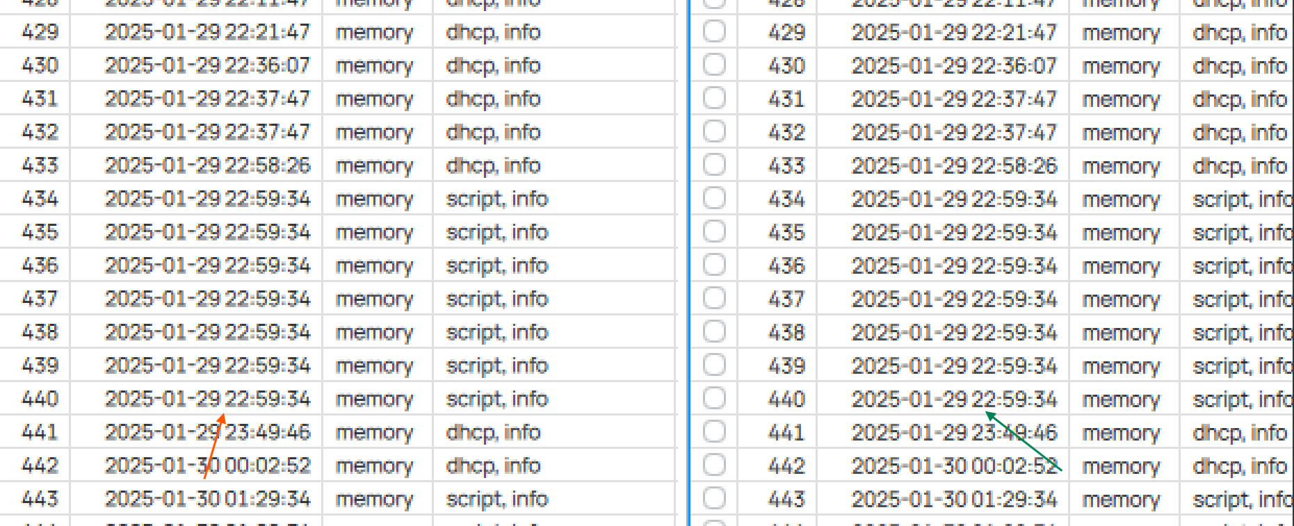
*) Table filtering: Restore autoscroll state when the user scrolls back to the end
*) Table filtering: Update filtered count icon when restoring workspace with quick filter
*) Form handling: Fix form’s multifield value update (e.g., bond port states)
*) Sorting issues: Fix IPv6 sorting
*) Context menu: Do not crash when the context menu target doesn’t exist
(e.g., Dude->RouterOS Info->Wireless Registrations)
*) Crashes: Fix crash on Disconnect
*) UI Navigation: Fix opening the correct window on different switch devices
*) User Interface: Show a warning in some more complex UI forms
*) Performance optimization: Try fixing line glitches when using fractional OS app scaling
*) Table filtering: Reset table filter row fields if the last “-” is pressed
*) Table filtering: Switch the table’s filter + - button order as it was in WinBox 3
*) Table: Change to a custom font that has same-width numbers
I don’t know exactly how to say but I think tables are better to scan now.
*) Performance optimization: Try fixing line glitches when using fractional OS app scaling
Not performance, but a bug-fix for me. I do not have any random “double-thickness” table lines anymore. There are some place with rendering issues (tab-element in window title bar for example). But the table-lines are now properly.
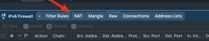
Between “Filter Rules” and “NAT” there is a different spacing compared to the other tabs.
It also appears on other windows. Seems randomly.

seems there are more scaling issues to fix
Beta 17 fix issue. Very thanks!
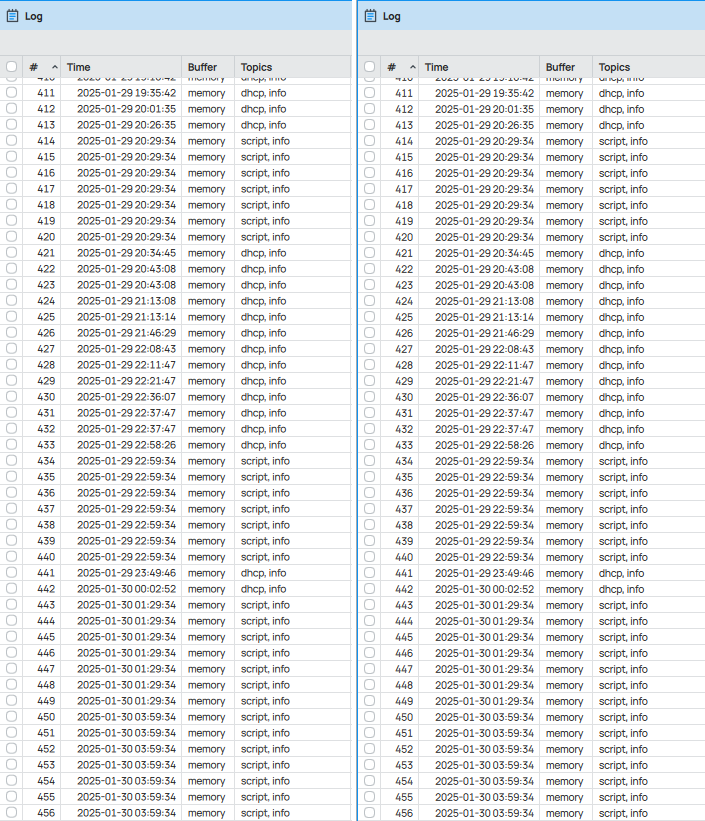
Sorting “Connection Mark” column in “Connections” does not work. The result is random each time the column title is pressed.
EDIT: Also in DHCP there are errors.
“Active Host Name”
“Active Class ID”
"ClientId "
“Comment”
EDIT: Seems that "sorting “Comment” column does not work at all.
That’s not fair. MT does a great job on collecting early feedback from users here. A lot of feedback was already worked into past betas. And as I now from own experience, developing a native app running on all 3 major platforms including proper handling of scaling etc is not an easy task. Further winbox3 was maintained for many years, and a new development will never match its predecessor from the beginning. But some peoples are never pleased, especially those never having seriously developed SW.
But back to topic:
The new font in tables has much better readability, especially in large tables with many entries. Appreciated!
The ideal font is always a depending on screen size, resolution, scale factor, subpixel rendering, environment light, glare, operating system etc. etc.
Please consider to make it configurable and let us choose from installed system fonts. The new font is not bad, but I can imagine situations were another font would suit better.
Same thing also I want next update
Please Help me for this
I don’t underestimate their job, I was just mean that it’s too early to say about any improvements, it’s still in beta and under development. It may not match its predecessor, but it shouldn’t be worse at least. And the latest beta is a good step forward to making it like that. Thanks MT for hearing.
Yes, pls see my detailed posts about them:
https://forum.mikrotik.com/viewtopic.php?t=210505&start=900#p1097187
http://forum.mikrotik.com/t/several-questions/1029/1
Huge thanks!
But this still doesn’t work properly. When I scroll up and then scroll back, it seems to work (though not always). But when I scroll up and then scroll back second time, it may stop working. After some number of scrolls up and back it may start or stop working again. I.e., it’s very unstable. Moreover, there is a slow reaction on new message. It autoscrolls within about 1-1.5 seconds delay after a new message appears. In v3 there is no such delay. Everything worked good in beta14.
Please FIRE your designers! One more crazy design decision. All tabs have the same color and this small line on the top of a tab is absolutely inconspicuous and barely visible. Return back as it was before.
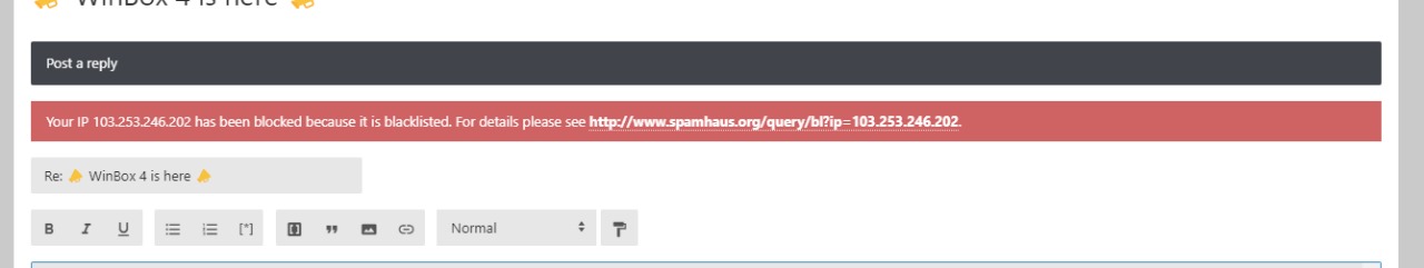
I just checked your IP address in the ban list. Not there.
So you’re not blocked here on the forum.
See Spamhaus as indicated in that message.
Thank you for the font improvements. The fixed width digits make the tables much more readable. I am using a zoom factor of 84% with table row padding 1 for a good information density, and the font now look “okay” (still not as good as the OS font) in light mode. I am using Windows with 96 DPI (100% Windows scaling setting).
BUT there seems to be a bug: With the above settings saved, right after logging in to a router, with the newly opened WinBox window, the texts are BLURRY! But if I press the Settings button, and increase the Zoom level to 92% then 100%, then back down to 92% and 84%, texts now appear sharper and more readable.
Attached are the screenshots where you can see that it’s blurrier on the left side (right after login) compared to the right side (after doing the zoom level change dance). Especially the bottom part of the digits.
Which means now I need to increase and decrease the zoom level after each WinBox start for the texts to be less blurry.
That’s why I prefer to write native non-multiplatform apps and use direct WinAPI calls to draw text (DrawTextW) without any libraries. Never had any drawing issues with such approach. May be some day they’ll realize it…
Thanks for making me feel old, that worked in the 1990s in Win32s. But Winbox3 likely starts with DrawText[u]A/u, so may be a while…
On that, I wish MT take styling cues from Windows 3.1 — I still miss menus/dialogs/etc have underlines that worked with ALT key to go to them (or some other key-combo). That styling actually be real handy in winbox to get the various place. Or perhaps a plain (without control keys) slash / should be mapped to search, kinda like [u]v[/u]i.
And it still perfectly works now in both Win32 and Win64.
I dare to conquer.
Plain old WinAPI is based on physical screen pixels and has no built-in support for screen scaling nor high-dpi. A text in a standard 12px font with DrawTextW() on a high DPI screen will will hardly readable. It requires handling WM_DPICHANGED messages and managing the whole layout in application code based on physical screen pixels. And the real fun starts when application windows are moved btw. screens with different DPI and scaling setting at runtime. Such as a notebook with integrated 14" FHD/100% and an external high dpi 4k/350% display.
Qt is widely used for professional single (and many multi) platform applications for a reason. Including IDEs, Video/Audio editing and 3D CAD applications. It provides a complete application framework and related tools, not just UI.
You are right. Obviously, the font size should be calculated prior to call. And yes, dragging between different-DPI screens is like a stress test for the app interface. I think, every developer should have such setup. I had fun with it for a while when I was writing my table component that is very similar to the tables in WinBox. But it worth it, because you have a full control over your app and doesn’t depend on any libraries. Of course, it’s easier and cheaper to use multiplatform libraries and this is the main reason of using them. But when a library has issues or limitations, you are just transferring these issues to you app.
And the following dialog becomes pretty common:
- Guys, why I can’t run your app on Windows 7? It shows some error!
- Sorry, we are using Qt6 and it doesn’t support Win7, we can’t do anything with that.
- F**k…
That’s why I’m trying to avoid any stuff like that in my own apps as much as possible. Just an opinion.