OpenAI: “It’s only 0.1% usage. Time for GPT-5.2.”
Users: “You don’t understand. GPT-4o wasn’t a model. It was my emotionally supportive best friend.”
Fast forward to the MikroTik forum.
MikroTik: “WinBox v4.0.1 is out. Cross-platform. Modern. New window switcher.”
Users: “How dare you. WinBox v3 raised my children. Those tabs? Perfect. The colors? Comforting. v4 feels like corporate blue grief.”
Same energy, different software.
At least MikroTik didn’t retire v3 right before Valentine’s Day. That would have been too poetic.
I wonder how do you comment "invention" of new selfdisposable paper straws? Is it good or bad decision to use them? What about cleared forest to make these straws or cups. Why we couldn't use natural cereal straws?
Tool that is named by users "good" as it's "good" what you can translate to "usable+effective+tailored to users needs" all-in-one tool. Not beacuse authors say so. If you start "inventing" without listening to users than it's a wrong way of evolution. Very wrong way.
For me it’s not “old good, new bad” or “innovation always right.” It’s about balance.
Yes, inventing things without listening to users is a great way to annoy them. Feedback matters. If people are using a tool every day, their experience is reality, not marketing slides.
But at the same time, staying frozen forever because “users like it this way” can also block necessary progress, compatibility, long-term sustainability.
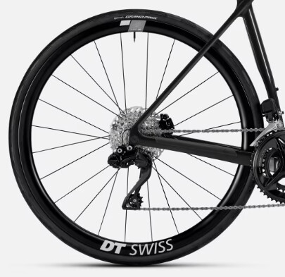
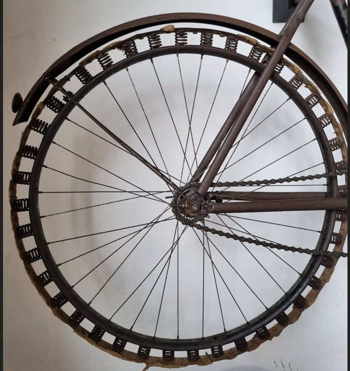
What very few people know is that the first evolution of the wheel from the original square design was a triangular one, (a great improvement, one bump less per rotation ) before the developers changed approach and used polygons with more sides, hexagonal, octagonal, etc. until they arrived to the final round one.
If a new wheel needs to be invented, it must be a rounder one,
What do you suggest to do?
How to help you and organize gathering process of problems, asks for features or other topics at one place and then be able to follow as they get "ticked out" step by step ?
Till now we do not have public place to see what was noticed by you, what was rejected, what is considered to maybe to be done.
Do not blame users, or I would say fans of Mikrotik, that they get at least a little upset/annoyed/frustrated and express it in the public.
These suggestions mostly come from experienced users that are old hands at MT's gears. If you have manage dozens of dozens of devices then every operation that takes even seconds more gets less effective.
Why don't you organize a workshop for admins to see what they mostly do and, what more important, HOW they do these operations effectively. MUMs were the perfect opportunities for such tests/observations.
BTW, what legit issues you work on to fix them as most of the time we do not have signals from MT side that sth. is really considered as an issue.
Oh dear, this thread. I’ve been learning MikroTik for the past year and I’ve only ever worked with WinBox 4 on my home lab network because I use Linux. That is to say I don’t know a lot but I certainly don’t mind working with WinBox 4 as it’s always worked well for me. I hope we all can work through the issues in a constructive manner and help the devs make it the best tool around.
The Mormon horse-drawn carriage has also been working well and efficiently for years, but that doesn't mean that something or someone can't be transported faster and more comfortably.
We, the users and buyers, probably got under the impression that noone from Mikrotik was reading these forums, at least not since beta1 first appeared, because most of the complaints have been repeated for so many times that people just had enough of it and gave up. There were some very nice summaries along the way, but no reply nor comment from you. And now you complain about off-topic when people are just trying to give you some analogy about fixing things that should not have been fixed.
My personal favo(u)rites:
- buttons on the right in WB-4 instead of top in WB-3, leaving too much unusable space.
- second level menus in multiple columns for no reason
- status bar at the bottom (probably will be OK after getting used to it a few years from now, eyes also have muscle memory and I always look for that info just under the title bar, which btw. used to contain ROS version, but not any more)
Most of which could be solved in half an hour, together with options to enable the “new” look for people who like it and some “WB3” skin for all of us who have been using WB3 for decades now.
Maybe you should run some AI through all Winbox 4 beta/rc/release topics /s
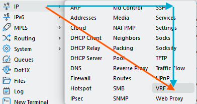
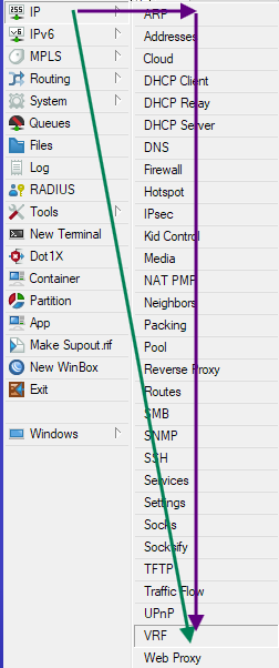
I have complaints about many areas in WinBox 4 but this particular point is fine and I find it reduces mouse travel distance, especially for the long menu like IP. Let's compare the total distance, for both the "diagonal" and the "right" then "down" approach:
If your monitor has not enough height, you'll even have to scroll with WinBox 3, another kind of movement.
But, what is also very important, is that there is less vertical movement to be performed. Particular in menus, where the height of the individual items are very small (compared to the width), hitting the right vertical spot is more difficult when there are a lot of vertically stacked items. You have to pick a small-height region out of 30 small-height regions, compared to only 10 for the "square" menu layout.
Look at the first screenshot and the blue arrows. Although the horizontal blue arrow appears to be long, that move can be done quickly because there are only 3 very wide items to pinpoint. The vertical movement is slower because you have to be more precise. With the old menu, it's this slow movement that have the most travel distance.
Open any dictionary or old school phone book or most restaurant menus, and you also see that the entries are organized in columns for faster lookup and access.
Maybe it is good for “ergonomics”, but not good for “visibility”. In WB4 it is actually harder to hit the right option because I need more time to find it. Also there is possibility to hit the wrong one on the left/right too, while in WB one could only hit wrong up or down (and trust me, with years this becomes more and more important). This is NOT a dictionary, but a computer program, and there is a reason why every other app I use has menus in one column. I remember people experimenting with multi-column menus 20 years ago, but everyone gave up on that.
Anyway, that is why I wrote the word “options”… give us the option to set the menus in one, two, three, even 15 columns if someone likes everything in one row.
I think a big part of the problem is the flat appearance. It became fashionable the just flatten everything, and I never understood why: it’s objectively worse to deal with interfaces like this.
I think Mikrotik already increased the distance between the columns, when the menu is big enough to need them (IP is one of them). It was a step on the right direction - but I’m not sure was enough. I believe people complaining is still having a hard time seeing where the columns are (is this two word? is this one word and two columns?).
One generic suggestion, that I already gave, and should be beneficial for all of us:
Do the graphic desing wherever You want, but do test and validation with some medium-low screen (do NOT use those beautiful Apple retina screens I’m sure You have), AND pass it through someone shortsighted, on his 50’s. It does make a difference for us, older users and who have a not so good screen and/or have to use it under the sun on the field.
That multicolumn menu was already discussed in the beta topic. For me, reading in columns is perfectly natural. However, some people are used to reading line by line, even when the layout is clearly organized into columns.
Maybe it would help to add slightly visible separators between the columns. Newspapers often do this so it is clearer how the content should be scanned.
In practice, people usually do not read these menus word by word. Instead, they scan for a specific letter, for example the "V" when looking for VPN, and they know it will probably be near the end. In that case I immediately look at the third column. This is easier than navigating a very long vertical menu, especially when considering the cursor movement distance.
 ) before the developers changed approach and used polygons with more sides, hexagonal, octagonal, etc. until they arrived to the final round one.