I have no problem with multi-column menus but I do not like it that the position of the items, even for the same RouterOS version, differs between devices. E.g. some devices do not have "System→Health” and that moves everything below “h” one position, causing e.g. NTP Client to move from column 2 (top) to column 1 (bottom).
I would say “always put health in the menu even when there is nothing there” but undoubtedly that has changed because someone else said “why is there an empty window when I click health” (as it was before). For me that was better.
Maybe in that case “health” can be shown “disabled” (greyed out) instead.
Really? What an answer? That is why we are frustrated with MT attitude to reported issues.
Its a usability problem, not the literacy one. What if people are accustomed to non-latin order. Is it still easy? Mind always thinks in mother tongue.
Scrolling long list is tedious and PROBLEMATIC if menu is longer than screen resolution.
The "not so new feature" that automatically arranges/moves/splits/callapses/whatever_you_want windows to screen margins in Windows makes it even harder as when you virtualy "touch" edges then system try to rearrange and whole process has to be restarted.
BTW:
It's not that hard to make a program with a good UX if you follow some rules:
prepare quantitative analytics what users do
get insights why they do it
gather some KPI focusing on User Satisfaction
LISTEN to the users to track behaviors and analyze feedback to identify pain points
optimize performance and go to 3 till KPIs get high enough.
That makes total sense. One would hope that the developers have the autonomy and the nouse to deal with the dichotomy of “always put health in the menu even when there is nothing there” vs “why is there an empty window when I click health” by choosing to put the item there bu grey it out.
Well this is just the kind of disrespect people are lately getting from Mikrotik
I knew several alphabets probably before you were born and still know them, thank you very much. (yes, now I am being disrespectful too, I know)
What I don’t get is why I have to strain my eyes to find something in 3 columns when I have plenty of space on my screen to put everything in one column? Reason about less moving the mouse are ridiculous, does it really matter if you will move it a few millimeters more? For me, it takes less than 10 cm (4” for people across the pond) to cross my whole 80cm (32” ) NON-TOUCH monitor. Might be different with touch, but I wouldn’t use touch interface for router configuration unless forced by someone pointing a gun to my head.
Can you imagine what would happen if YOU (Mikrotik) should add another option let’s say between “Cloud” and “DHCP Client” in IP menu? Everything else get shuffled, “SSH” is no more last in second column, but goes to third, all muscle memory has to be retrained, productivity goes down… With one column everything is still approximately in the same place, 1/10 of a millimeter mouse move away.
Just give us OPTIONS, please! Make the software better, not just “better looking”, some of us still prefer usability over looks…
Reading: yes, because during the years people figured out how many letters should be in one line of text for optimal reading. But guess what: when you have some poetry (even Vogon), or a recipe, it is not compresses to column width, but spread out verse by verse (or by ingredients). And menus are not about reading text, they are about finding the right option as quickly as possible without having to read everything else.
When opening Winbox and logging into a router, I see it saves the last windows open and positions, is there a way to disable this so that I have a clean slate after each login?
I usually find myself stepping into a router with 20 windows open from my last session and multiple terminals open, it would be great if there was some sort of option to not remember the last state of Winbox after the last time I left it like a bat out off hell.
Fantastic work on the Beta as Ive watched it grow and update from the initial release!
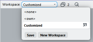
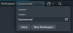
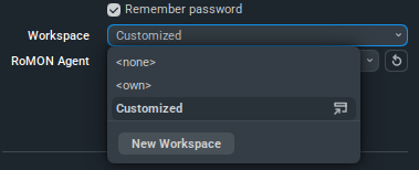
Yes. You can do that by selecting workspace none instead of own in the dialog that opens the connection. (there are brackets around the words none and own but the forum does not allow to type them)
Before, there also was the option to have a shared workspace for multiple devices, but sadly that is gone.
The workspace files, in the example above Customized.cfg.viw2, are saved under ~/.local/share/MikroTik/WinBox/workspaces. Maybe you can go there and copy one of those existing __ip.add.re.ss.cfg.viw2 to a new workspace name?
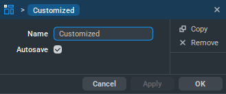
"New Workspace" is there since first public version of v4. At least I have a custom workspace for long time. And it does not automatically save changes - against other claims before in this topic. You always have to hit "Save".
Okay apparently it works differently for everyone. And unfortunately there is no documentation so no way to find how it should work or what I may be doing wrong…
(there is a WinBox entry in the manual but it is for WinBox 3 and only refers to the download page for a version 4 that is being made available)
Workspace management is the main - and possibly only - draw with v4 for me. It was fine in v3 until recently, when it somehow stopped remembering the appropriate sessions to associate with each device. And there’s also the issue of the whole workspace getting mangled or destroyed, should you happen to start WinBox in some unusual way. Being able to select a more modern font is also nice.
Other than that, v4 is slower and has much more vague controls. (difficult to find, interpret and distinguish) I’m hard stretched to think of a single, clear improvement in v4, as far as actual usability goes.

 ) NON-TOUCH monitor. Might be different with touch, but I wouldn’t use touch interface for router configuration unless forced by someone pointing a gun to my head.