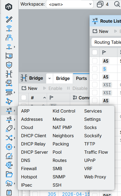
Even on a tablet I would prefer when that tick on “save” would briefly make it turn blue (to confirm that it has been done) and then the whole dropdown to disappear by itself.
Have a problem with cirilic fonts
Could the new design be updated to include the ability to organize all sub-items into a single column? And if the app is ~50MB, consider adding colored icons for the main items, as they're simply more visually appealing and easier to understand than the new blue icons.
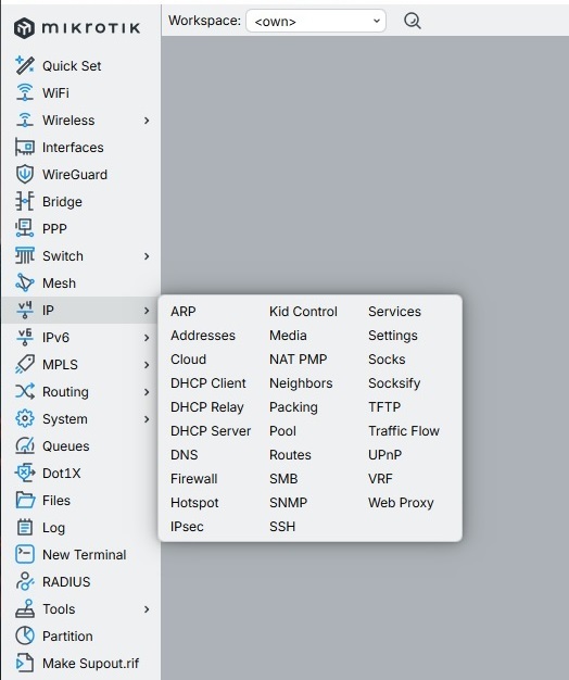
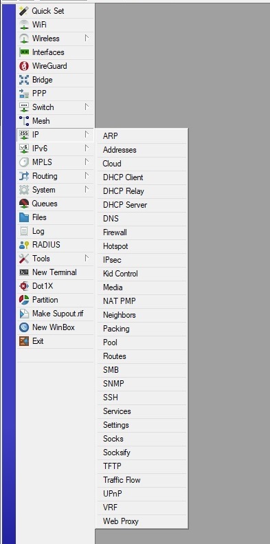
p.s. I hope the person who designed v4 gets fired and never hired again...
p.p.s. The v3 design was so convenient and intuitive, but instead of refreshing and updating the familiar, time-tested design, they simply went with some kind of iPhone-style, lousy design.
I guess the original design was developed using an old toolkit that only exists for Windows, and as one of the objectives of v4 was to be multi-platform, they had to switch to a new toolkit, which invariably means “new style” UI and thus bad usability.
That is not to be blamed on MikroTik, it is just the disease of the 2020’s which will probably be reverted in a couple of years. Change to have change, not to improve.
I highly doubt that colored icons and submenus are that difficult to implement in 2026. Moreover, what was the problem with simply transferring the design to a new engine with the addition of new features? Why change the arrangement of settings in tabs, redesign the fonts, change the icons, and so on?
p.s. I understand that this has all been said a hundred times already by other forum participants or at conferences, but damn, if only they listened and just did what they were asked... Previously, the program took up 2 MB and was as clear and visual as possible, but now it takes up 50 MB and looks like a vibe-coder's generated garbage in an evening (which Winbox has only seen in pictures...).
While many things became worse in WinBox 4, and I myself have written many complaints about the changes made in WinBox 4, including much higher resource usage; I must also admit that there are quite a few areas that WinBox 4 does better. So, here is my appreciation list:
-
Alt+Fsearch. -
Tabbed windows with the tables can be cloned as many times as you want, so that it's now possible to see the "Bridge Ports" table at the same time as the "Bridge VLANs" table, for example.
-
The properties sheets (which are also tabs) on the forms can be grouped and put together on the same page, very convenient when editing firewall rules. However, this still needs improvements, the grouping currently breaks when you switch tab, which is unfortunate.
-
Tables can be sorted by more than 2 columns.
-
Table columns can also be auto-sized by double-clicking on the separator (while this is a standard feature for many grids / tables, even for ancient Windows, it was not possible in WinBox 3).
-
Better "Files" browser, that doesn't expand the huge tree of directories and files at once and lock the UI for a long time.
-
Dark mode (although color choice could have been better).
-
Customizable fonts.
-
Monospace font for script editors.
-
More fine-tuning options for scaling and spacing.
-
Unicode support. While this causes a one-time breaking change when first migrating from WinBox 3 if you use non-Western-European texts, in the long-term this is a much-needed change.
-
When using keyboard, the
Alt+A/Alt+Swindow switcher is a neat feature. However, if using the mouse, it's less ideal, due to the long mouse travel distance from the switcher button to the vertically centered window list. -
Controversial, and I am in the minority, but I like the multi-column menus, haha. But I agree that there should be a setting option to make it one column.
Of course, many of the items above were only added / implemented after we've written ton of posts in the beta and release threads. For those items, MikroTik did listen to feedback  .
.
Currently there are also other areas where WinBox 4 works better with newer RouterOS releases, while version 3 is buggy or broken. But I don't consider these as WinBox 4 improvements, as it's only that way because MikroTik decided to abandon version 3 and no longer update it to work with the newly introduced data types and metadata of recent RouterOS.
But nobody is doing it. All programs these days have the same contrastless borderless gray-on-white UI now. So apparently it is the way to do it now.
Content deleted by author.
I would say "wrong" instead of "different", but that is probably because I am old and grumpy.
The winbox 4.1 or any 4.0 are so slow that makes it impossible to jump ship. I manage mostly three routers at a time with heavy ISP configuration, and even adding firewall filter rule takes 10 seconds or so. The winbox kind of freezes, moving from one field to the next with tab or mouse is tiresome.
Winbox 3.43 on the other hand is as fast as has always been.
Using both winoboxes (4.1 and 3.43) on the same Windows 11 Pro PC, one is a snail the other is what has always been.
Maybe I'm an old fart, but when I first saw WinBox in 2014, it was simply mind-blowing. A unified interface, a nice, clear design, even someone unfamiliar with Mikrotik could tell it to click the "green icon," click "255," click the "gear"... It would be fantastic if they added a v3-like interface style, but with updated hiDPI icons and new functionality.
Content deleted by author.
Content deleted by author.
tl;dr
you could name plenty. Even Wireshark is built with Qt.
I’m not too fussed about the icons, but they clearly shouldn’t bring the old Windows 95 style icons into WinBox 4, since they’ve made a conscious decision to go for this modern style. If you do insist on having icons, I might agree that a little more color might be useful.
But then, the main menu is too busy, overall. Why do PPP, Mesh, Queues, Dot1X, LCD (!) and RADIUS need their own entries?

A remark on 4.0 and 4.1: If I start the program (Win11, 25H2, different devices but all behave the same way), it takes too long to startup. The following starts are faster, I think the software is in RAM then. But I see room for improvements there.
make the firewall look like it does in winbox 3.43, i.e.
- comments are a separate line, stuck on top of the line, so that the rule line does not increase in height due to comments
- Add actions for the rules on the right mouse button
- Make a horizontal separator like "show categories"
Content deleted by author.
Hey MikroTik team,
Have you ever considered collapsing the left menu so only the icons are visible? The labels could be moved to tooltips, and they would appear when you hover over an icon for a few seconds. The menu could be collapsed/expanded by clicking on the logo or by toggling the corresponding option in the settings.
Take a look at the Task Manager in Windows 10/11 for the reference. This would free up a lot of space for child windows.